
Pace Layer Mapping
This is a recording of a talk given at UCD Gathering, Thursday, 18 November 2021.
Delivery teams and user research practitioners often have problems working together well. They work with very different artefacts, often operate on different timescales, and both groups can experience conflict over the value each discipline brings to the end product.
We’ll tell the story of several different attempts at helping teams integrate research work effectively. We’ll talk about what worked, what didn't, and how those attempts eventually evolved into the practice of Pace Layer Mapping.
Pace Layer Mapping builds a common artefact that shows (a) the confidence we have in research insights; (b) what we need to do to increase that confidence; and (c) how stable that research is over time. It allows the whole team — product managers, researchers, and engineers — to come together around research insights and methods effectively.
(An earlier version of this talk was given at Outcome 2021 and #mtpcon Digital 2020.)
(A stand alone PDF of the slides is also available.)
Slides & Transcript

Hi, I'm Adrian Howard. And I spend my time working with companies who are having problems where the work of product management, user research and agile delivery overlap. One of the pain points I often encounter is where teams fail to integrate user research work effectively. Helping teams do that better, eventually led to what we're going to talk about today, Pace Layer Mapping.
And yes, it's yet another canvas!
Product Management and User Research are full of canvases. You're probably familiar with a bunch already. Google will get you a bunch more. So you know what to expect.
First, I will briefly explain the structure of the canvas. Then I'll fill in some of the details from a nice simple example. we'll sprinkle it with a bunch of post-it notes and show how it solves that simple problem for you. And we're done!
I'm not going to do that.
Instead, I'm going to tell you about the long, messy, complicated journey that eventually led to the Pace Layer Mapping canvas and practice.
It didn't spring fully formed out of nothing — like the products you work with. We started solving one problem saw some value, experienced other problems, ran experiments, learned from our experiences, and evolved the practice over time to help solve new problems. So that's the journey we're going to go on today.
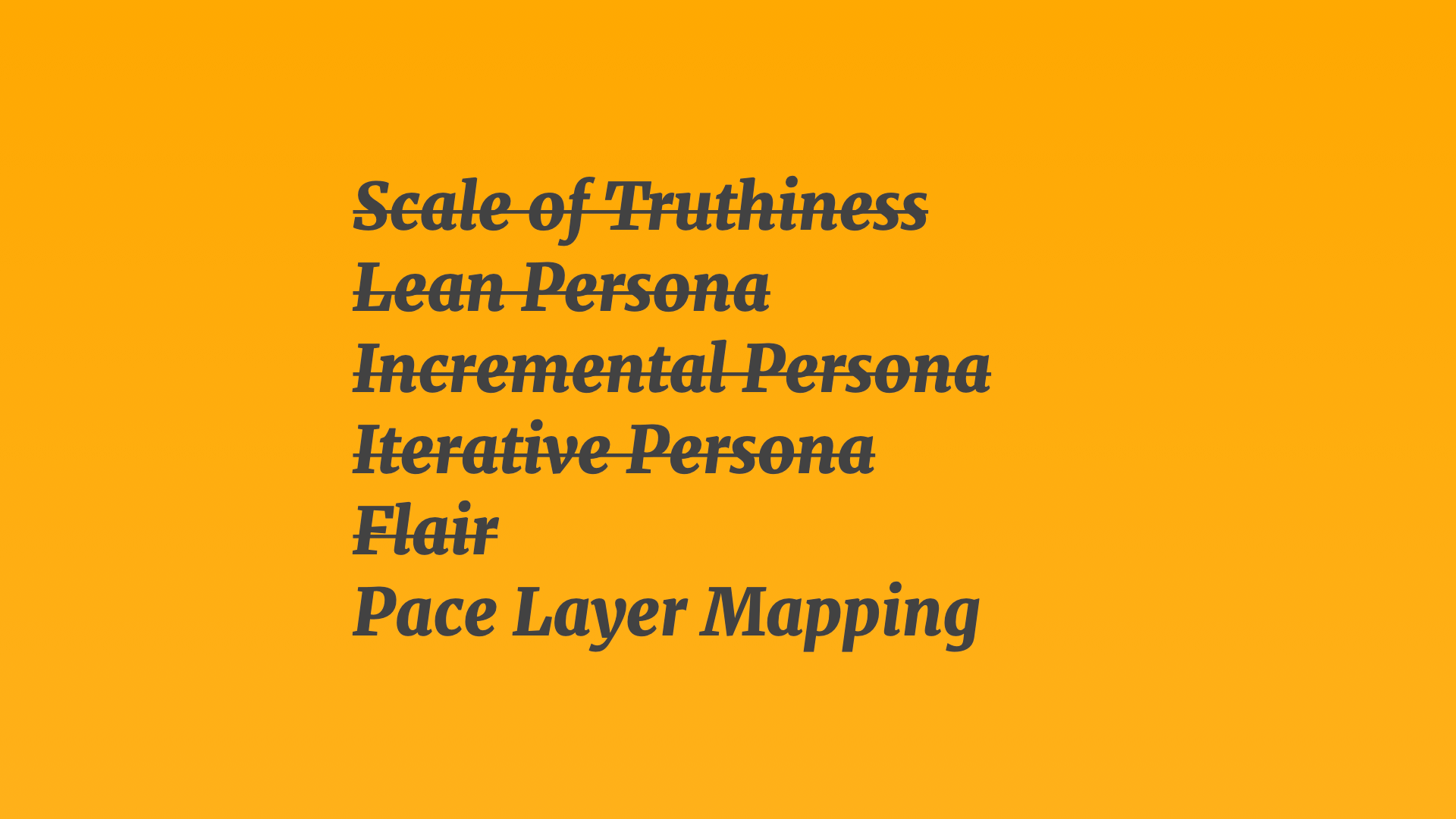
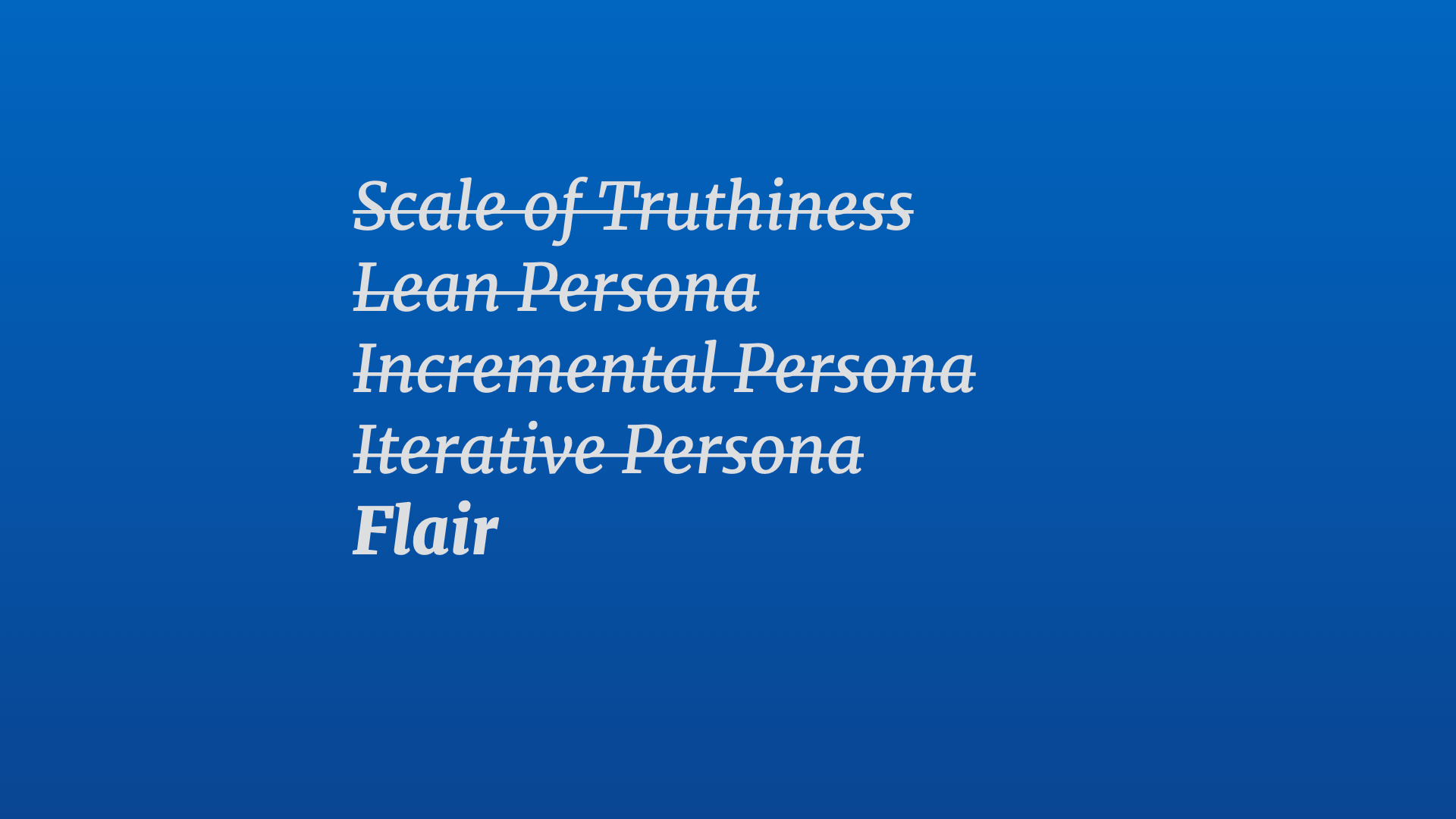
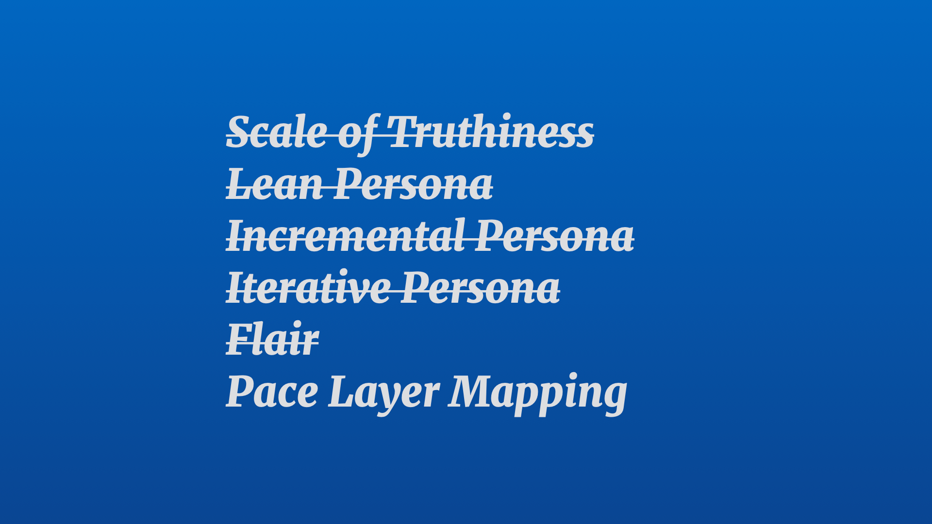
We started with an alignment problem that we solved with a practice called Scale Of Truthiness. After that alignment problem was solved, the practice evolved into something called Lean Persona when it became more of a persistent artefact, rather than a one off activity. Which then evolved into something we called Incremental Persona, which then evolved into something we called Iterative Persona, which then evolved to add another structure we called Flair. Which eventually broadened out and changed a bit more into what we're now calling Pace Layer Mapping.
All of those things were useful at different times for different reasons. They solved some problems and raise new ones. And for those who want to switch off now, that's the lesson I want you to take away today. That the artefacts, practices, and tools that you use for your work should be… well… useful! And when they're not — change them until they are! Don't just take something off the shelf — customise it and build it for your context.
Let's return to the beginning of this story. With the Scale Of Truthiness. I started using this with a startup that was still figuring out problem-solution fit. They'd done some early customer development work, built some early prototypes, delivered some MVPs, hired a bunch of people — but were beginning to have problems identifying and solidifying their target market and their target customers.
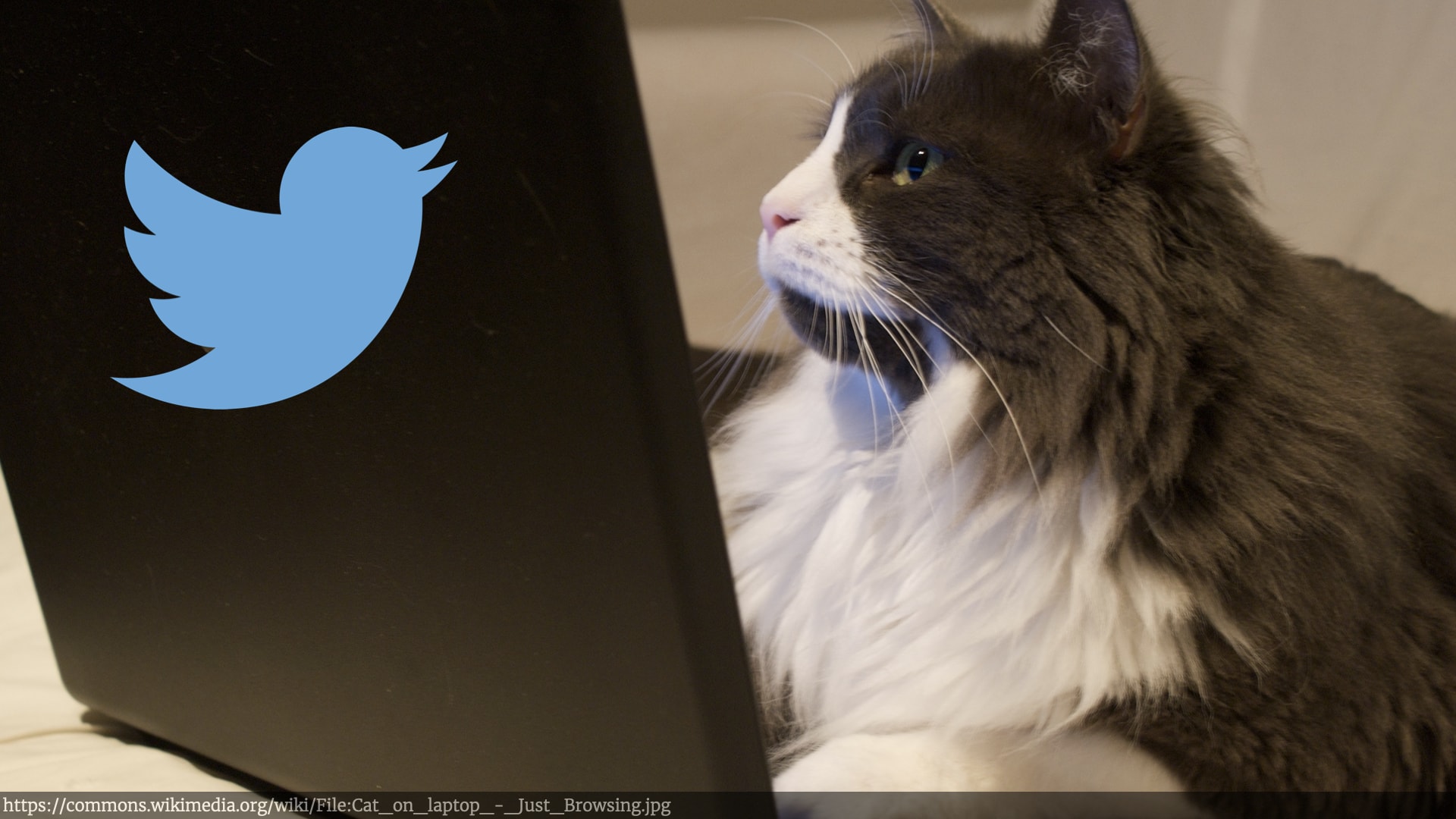
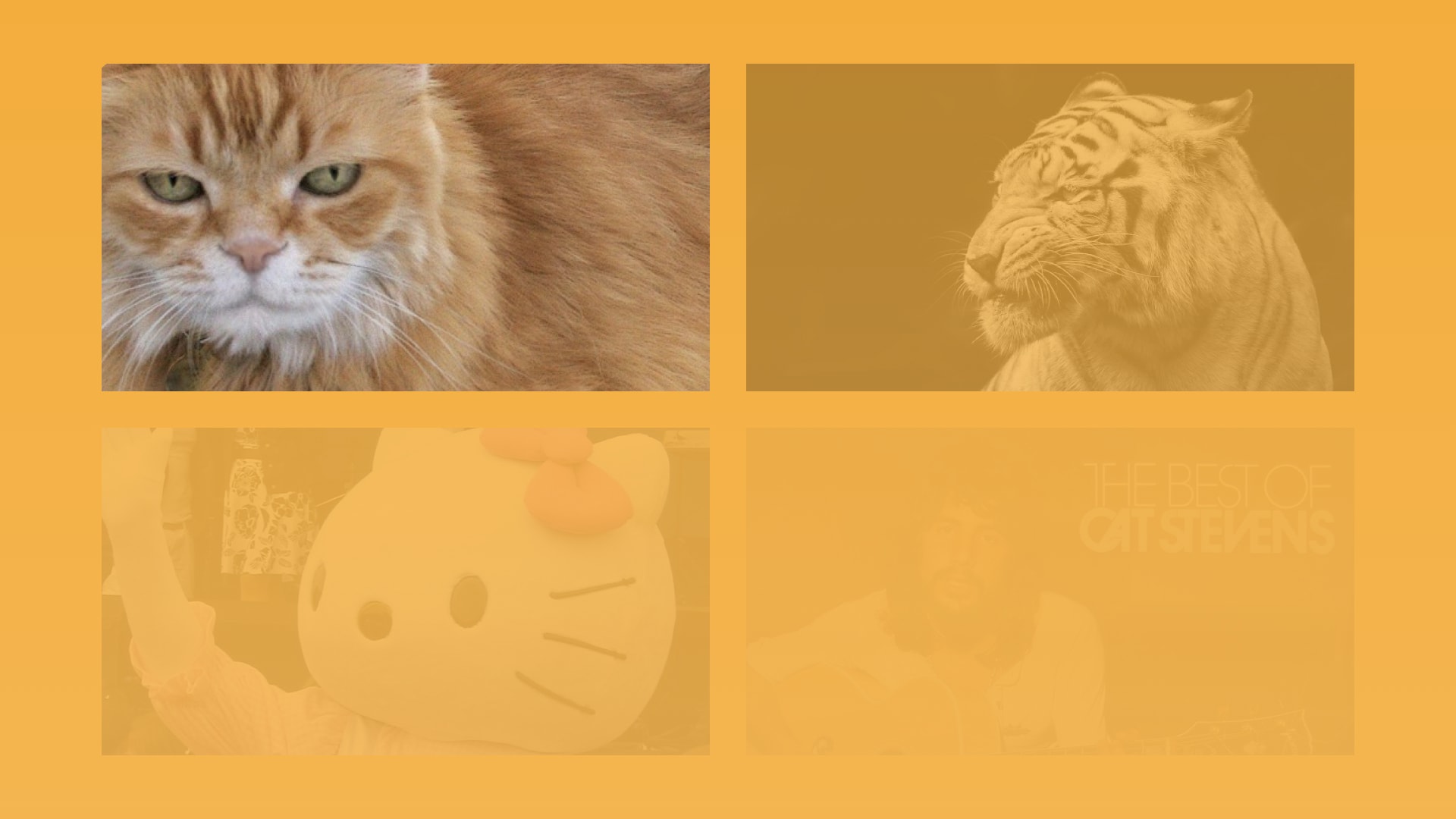
The details of what they were building doesn't really matter. So I'm going to simplify things, and say they were building Twitter for Cats.
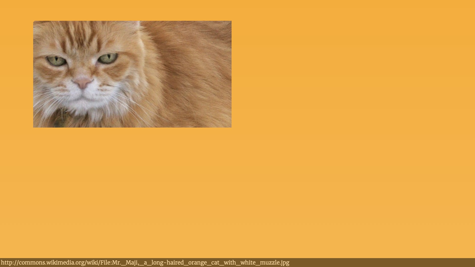
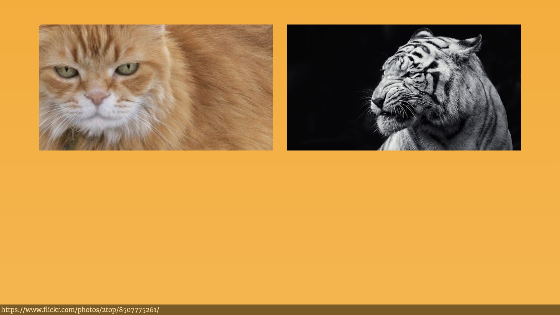
They hired me to help them get some clarity on those problems with their product strategy and vision, and who their customers were. After talking to a bunch of people at the organisation, it rapidly became clear that there was a serious lack of alignment on who their customers actually were. When you talked to the product managers, they thought they customers look like this…
While the developers thought they looked a little bit different, maybe something more like this…
The designers thought they were building for something that looked like this…
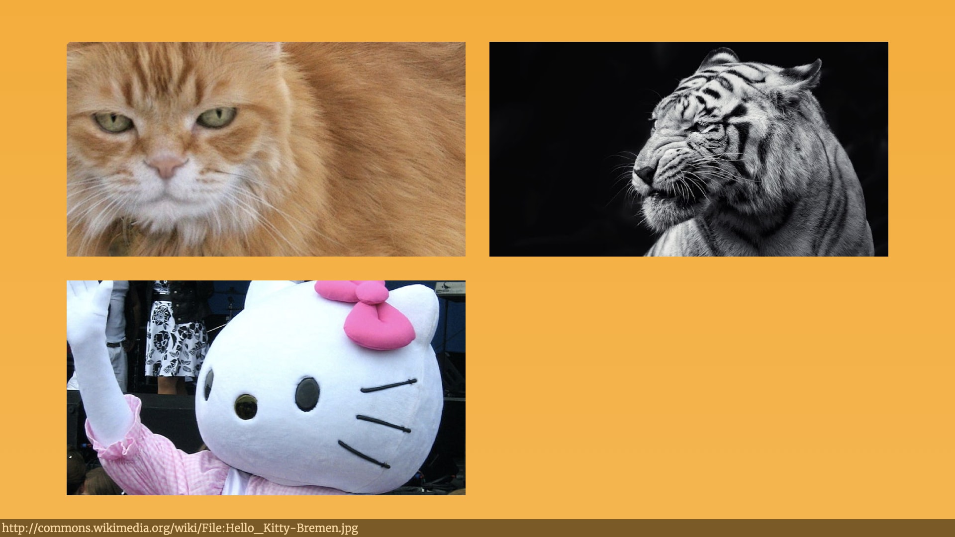
And some of the investors were thinking about a kind of customer that was so far away from everybody else it was it was actively confusing…
Unsurprisingly, this lack of alignment on who they were building for — and whose problems we were trying to solve — led to a lot of conflict within the organisation on what direction the product should go in.
I'm sure the process of herding different stakeholders with different needs is familiar to you. It's what product managers and user researchers spend a lot of their time doing. So I did what I expect many of you would have done in the same situation.
We got all the stakeholders in the same room with a lot of paper, sharpies, and post-it notes. We even got a few of the end-users of the product in the room too. We split folk into groups, and got them to start articulating who they thought the product's customers were — using a few different methods from a few different people.
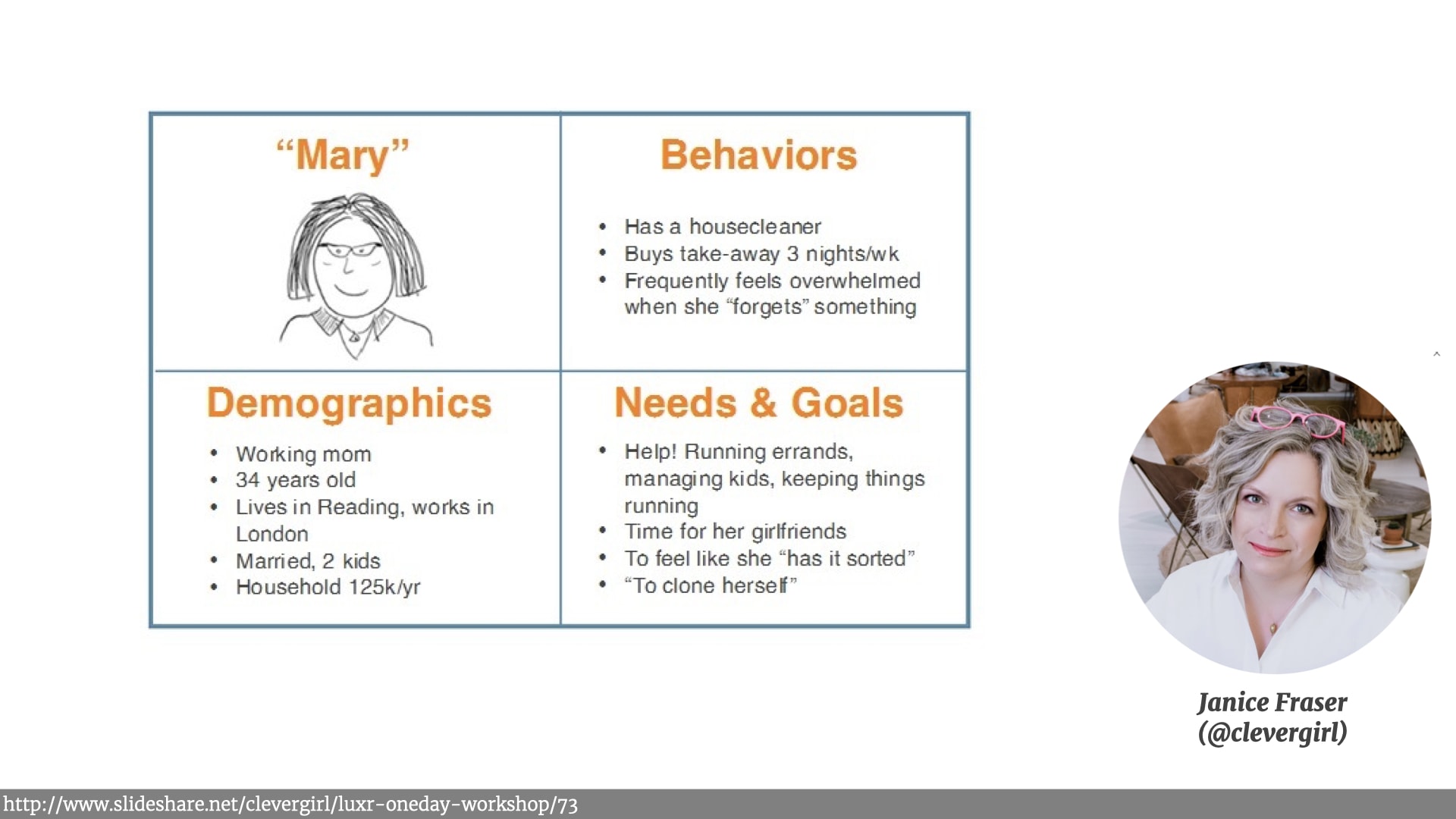
We got them to use simple four-by-fours to describe the typical customers. Something I first learned from the writing of the excellent Janice Fraser.
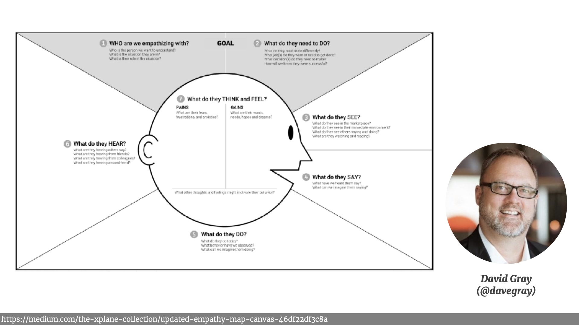
We got them to use empathy maps to describe those customers experiences, what they saw what they heard what their pain points were. A practice I learned from Dave Gray's work.
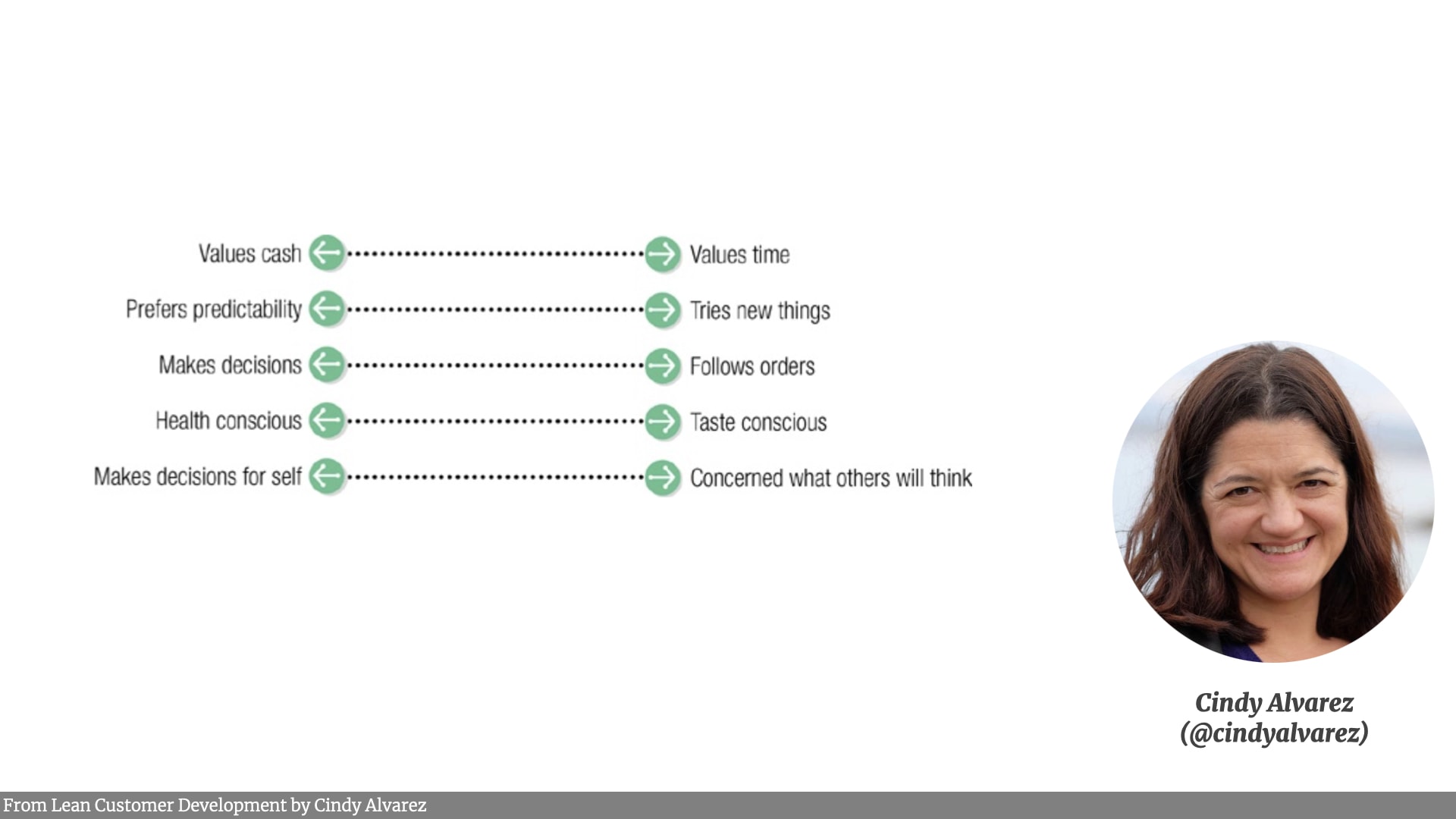
We also got people to come up with different dimensions and continua that they could put customers on. Something I learned from Cindy Alverez's Lean Customer Development book — an excellent read.
Once the individual groups were happy, we pulled that information off those sheets and artefacts, and threw all the evidence and assumptions and wild-ass-guesses onto post-it notes — and stuck them up on the wall.
At this point, we hadn't got alignment! We in fact had a lot of disagreement, as people walked the wall and saw how different people saw the customer. People had different conclusions about what their pain points and gain points were, what their behaviours were, what kind of people they were, what assets they had.
Which is where the Scale Of Truthiness comes in — and it's really simple.
We just drew a line right across the length of the wall. At one end of the scale are things we've basically made up — guesses. And at the other end of the scale are things we're really confident of. Things we have a lot of evidence for.
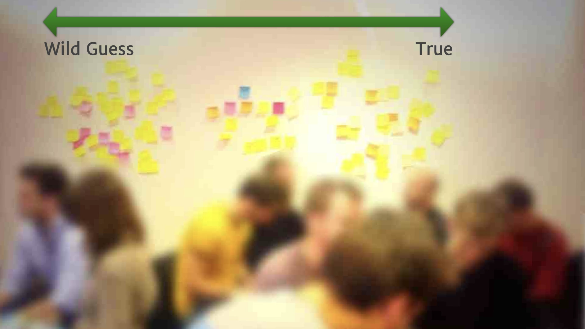
We then got folks to justify where their things sat on that scale. Which led to lots of interesting conversations about what counts as evidence, the different experiences people have had with customers, and so on.
We saw situations where someone from marketing was saying customers will like "this". And someone from the product group saying customers would like "that". Then the customer in the room saying "Sometimes it's 'this', sometimes it's 'that'".
There was lots of discovery there — even though there wasn't lots of research. At that point, it was just getting everybody on the same page about how everybody else saw the customers.
Ideas that were mutually contradictory, Obviously, couldn't both be true. Which led to much more productive conversations about how we could figure out what the real state of the world was. People started annotating the board with research activities and experiments to help figure those things out.
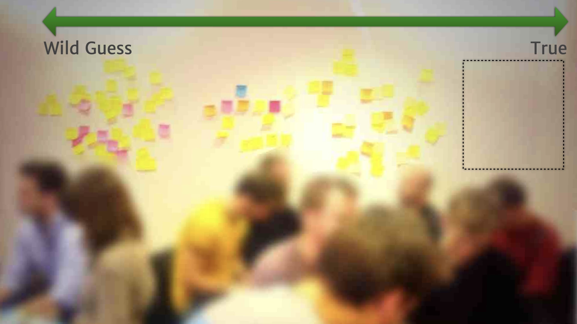
When things settle down a bit, it became clear that we needed to move that scale of truth further out. Because nearly everything that we had discovered, needed more research and experimentation to either invalidate or validate it.
And as the facilitator for this session, it helped me make sure that a few of the "facts" that the team seemed 100% certain of actually got checked as well!
While we weren't yet totally aligned on our customer — there was still a lot of disagreement — we could begin to see that some options were much more likely than other options.
We had some solid next step for research and experimentation to clarify those areas of uncertainty — and hopefully get everyone talking about the same customers in the organisation.

Now, some folks will be saying at this point that these people should have built proper persona upfront, and that might well have helped. Persona for those who have not used them are research based archetypes of our customers that are usually summarised with some kind of persona description. They're an artefact that comes out of user research work.
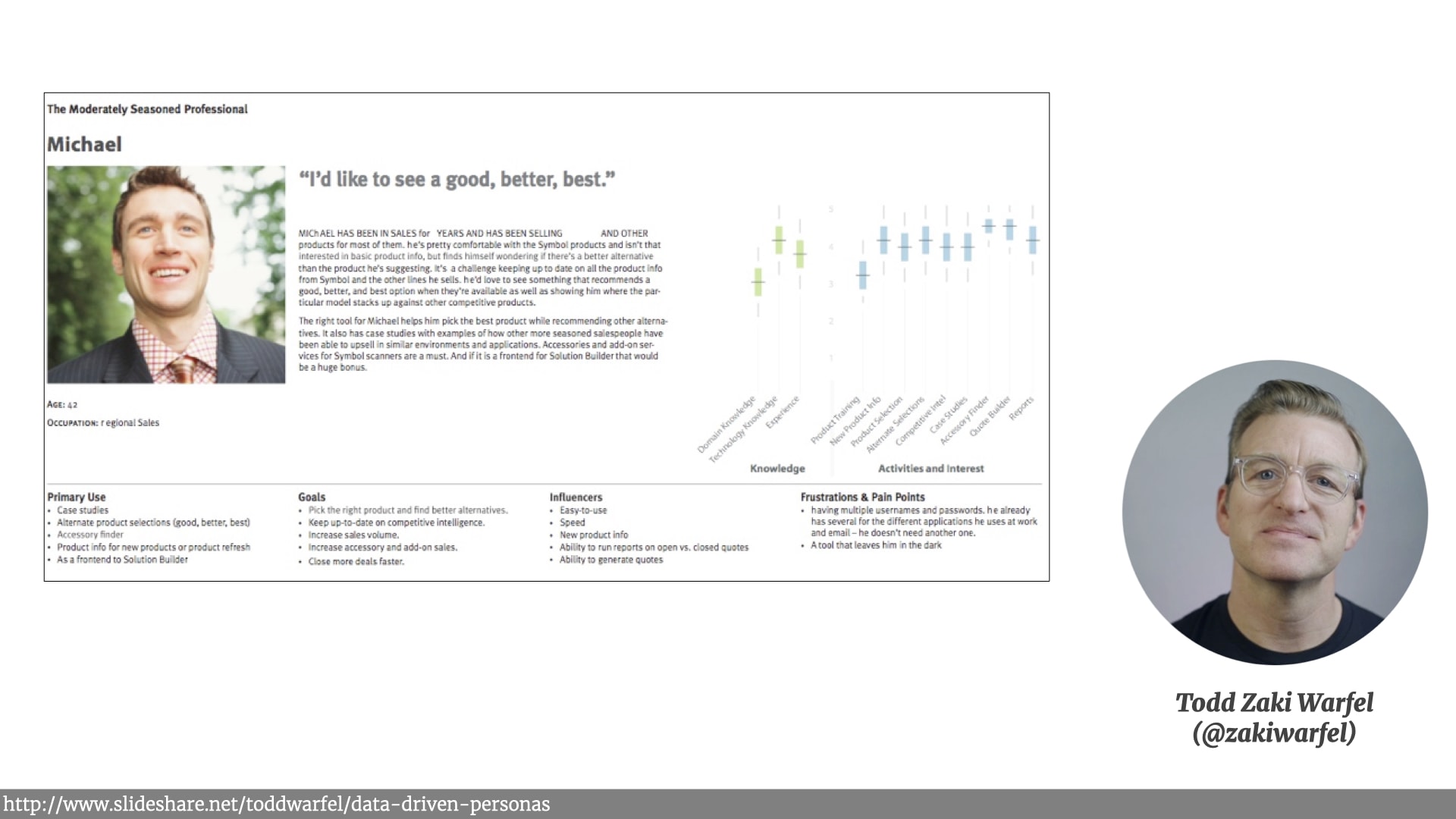
Like this example from Tod Zaki Warfel. It can be a really useful and powerful way to quickly communicate the results of user research. Persona can also be misused, and lead teams to make dumb mistakes. I've certainly experienced both scenarios in my work. I'm not going to get into the details of the whole personas-good vs. personas-evil argument. Ask Twitter and lots of people will shout at you.
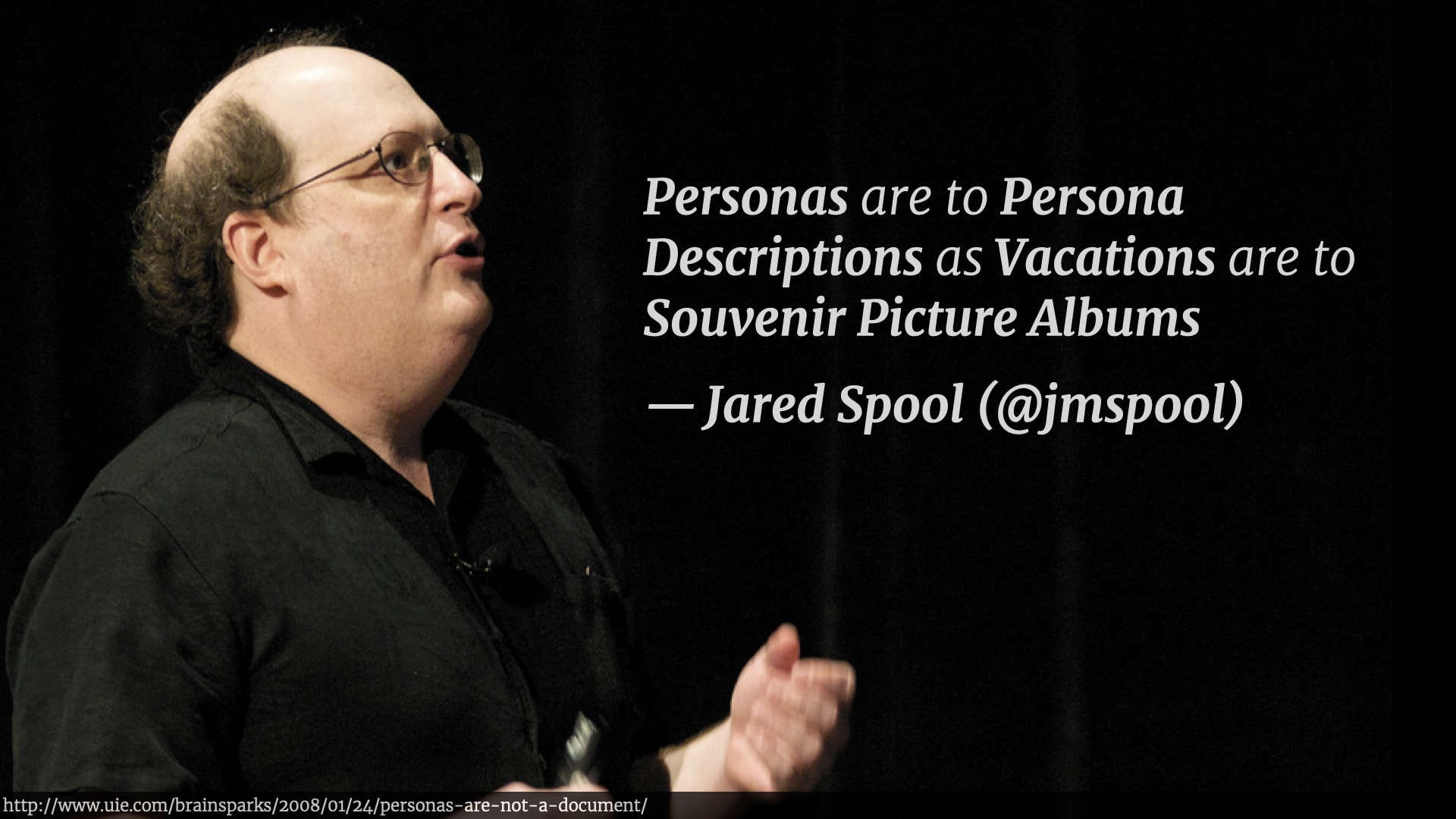
However, I do love this quote from Jared Spool…
“Personas are to Persona Descriptions as Vacations are to Souvenir Picture Albums”
They’re a great reminder — but they don’t actually replace the experience. A picture album isn’t the same as going on holiday. A Persona Description isn’t the same as experiencing that research process.

So what we had after the Scale Of Truthiness exercise wasn't a persona description. It was more like a snapshot of a bunch of research questions around the company's customers. It was something that, with some more work, might get distilled down to a persona description. But instead, something a little bit more interesting happened.
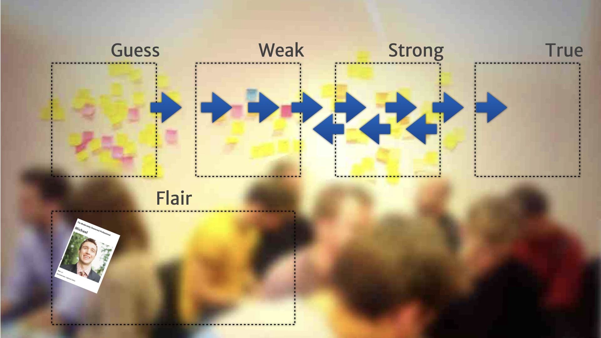
That Scale Of Truthiness artefact got left on the wall. People started referring to it during product and development work when questions about customers came up. It stopped being the output of a one-off alignment activity, and started being an artefact people evolved over time and actively updated.
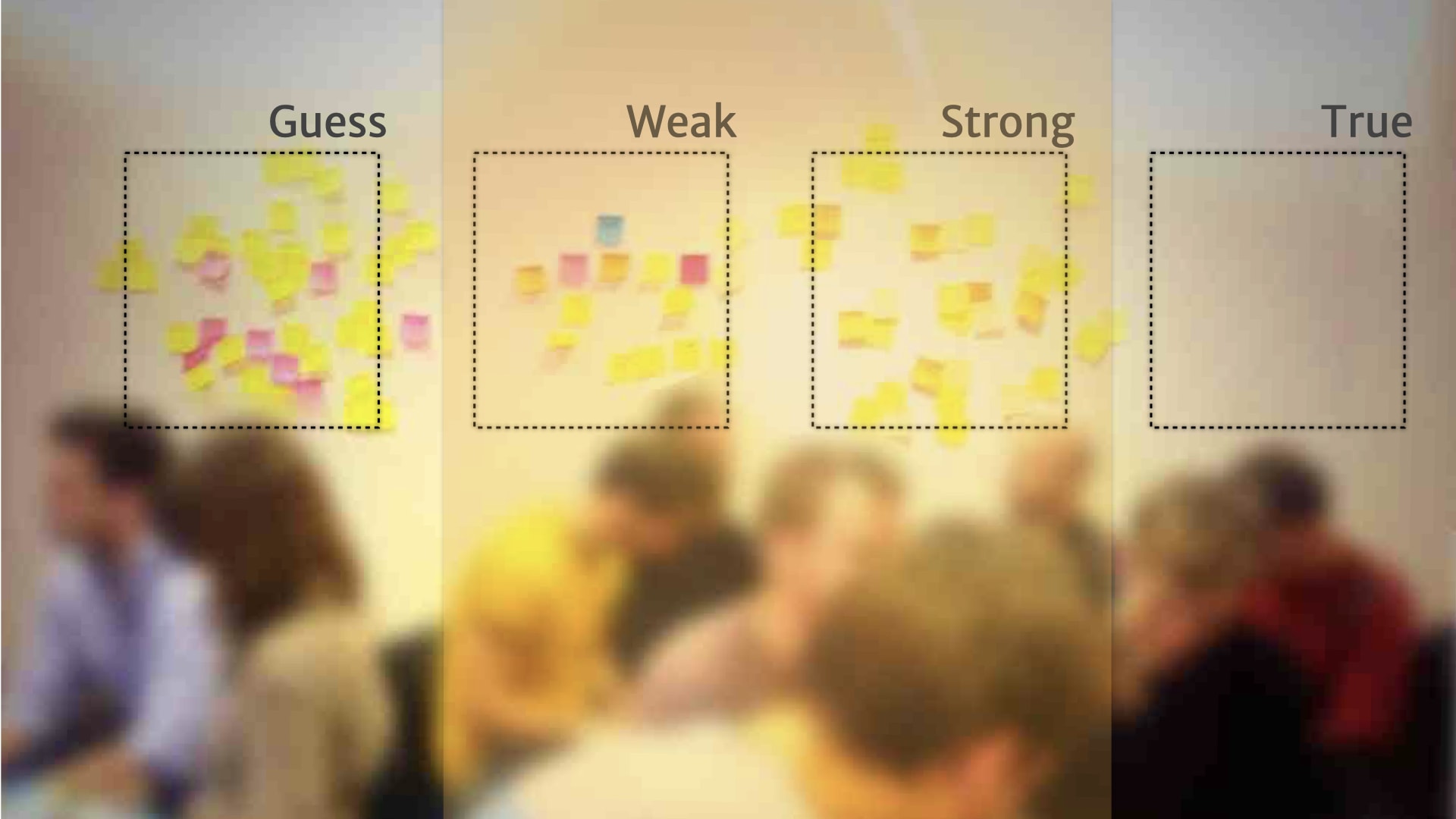
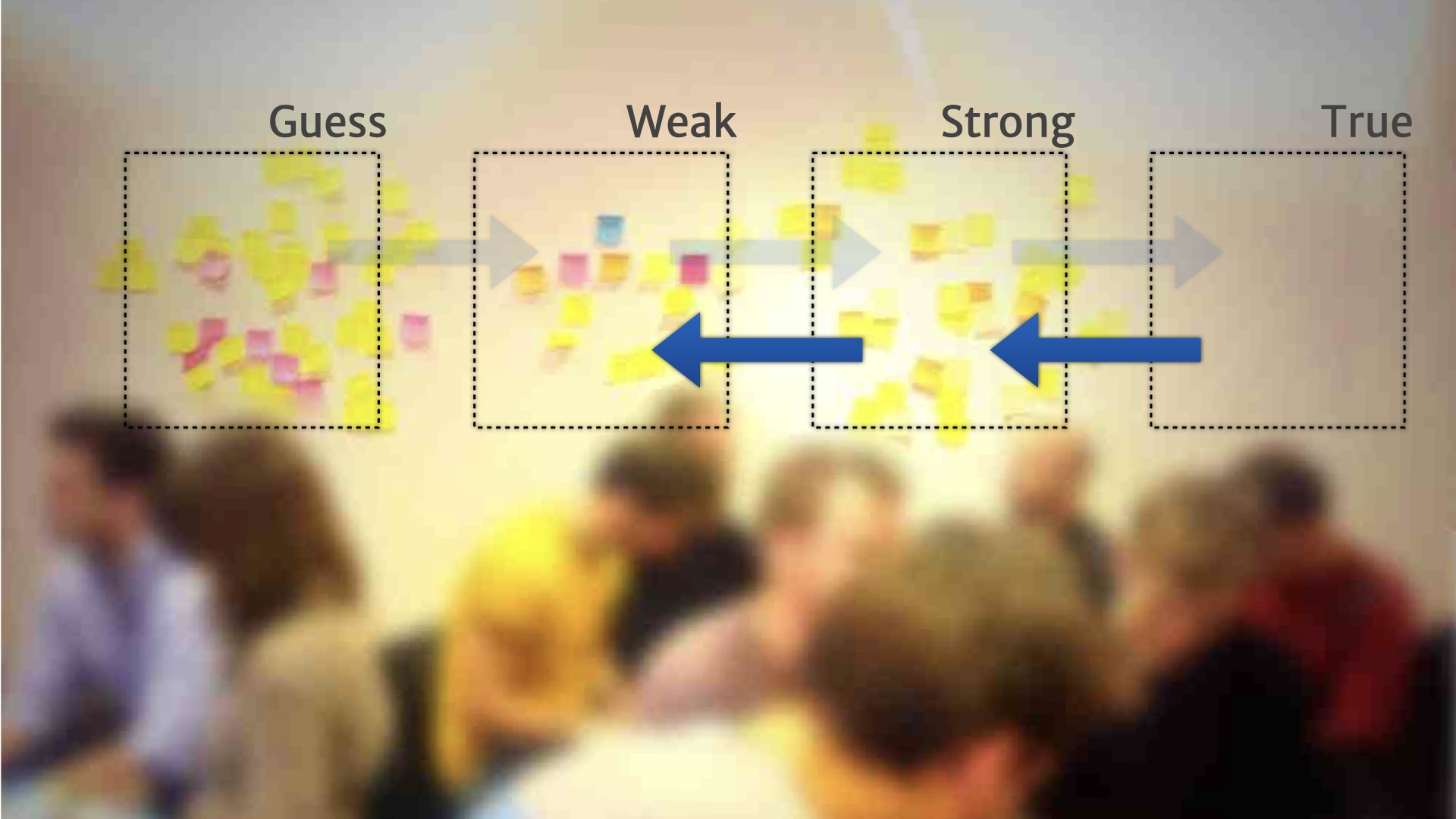
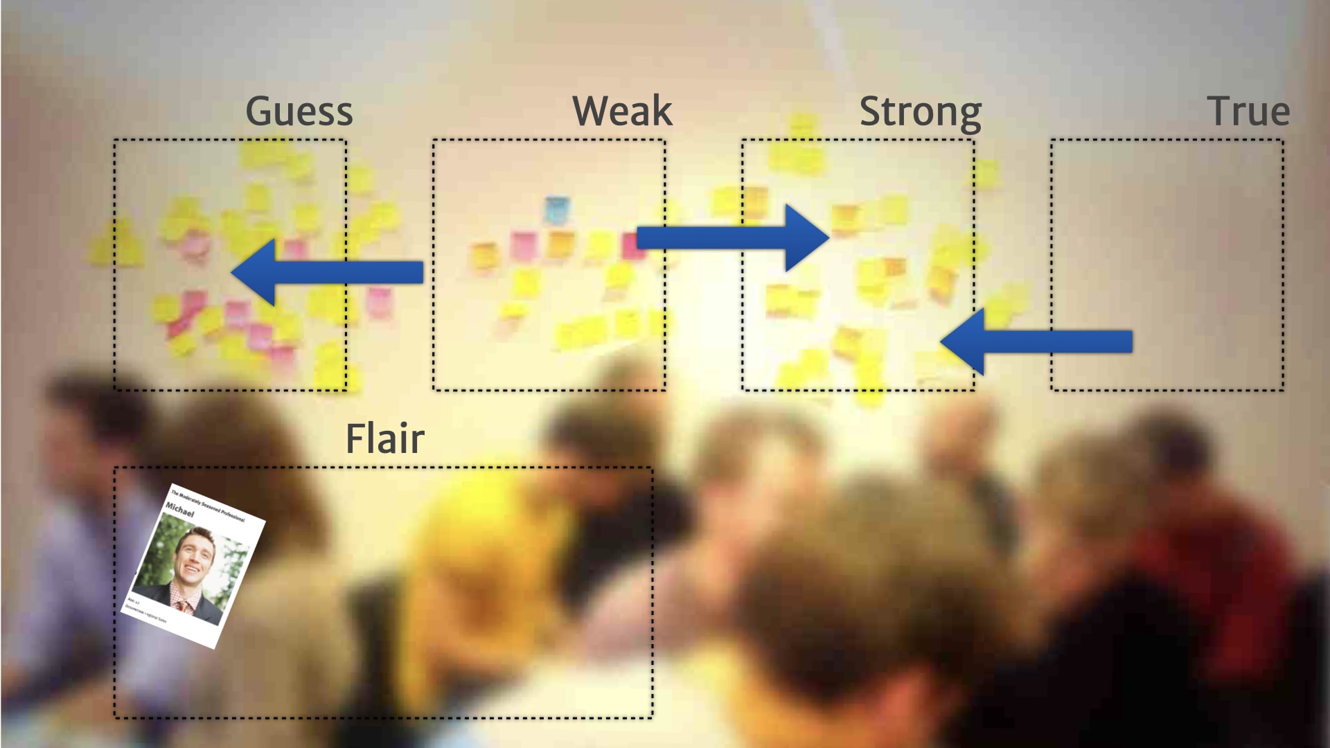
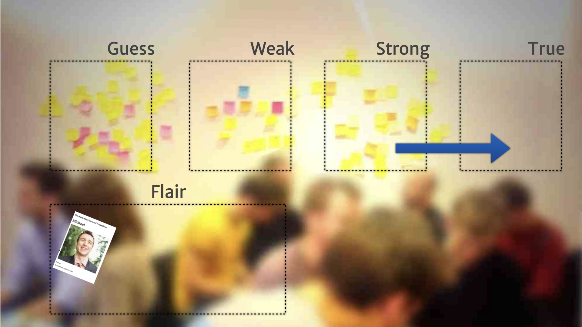
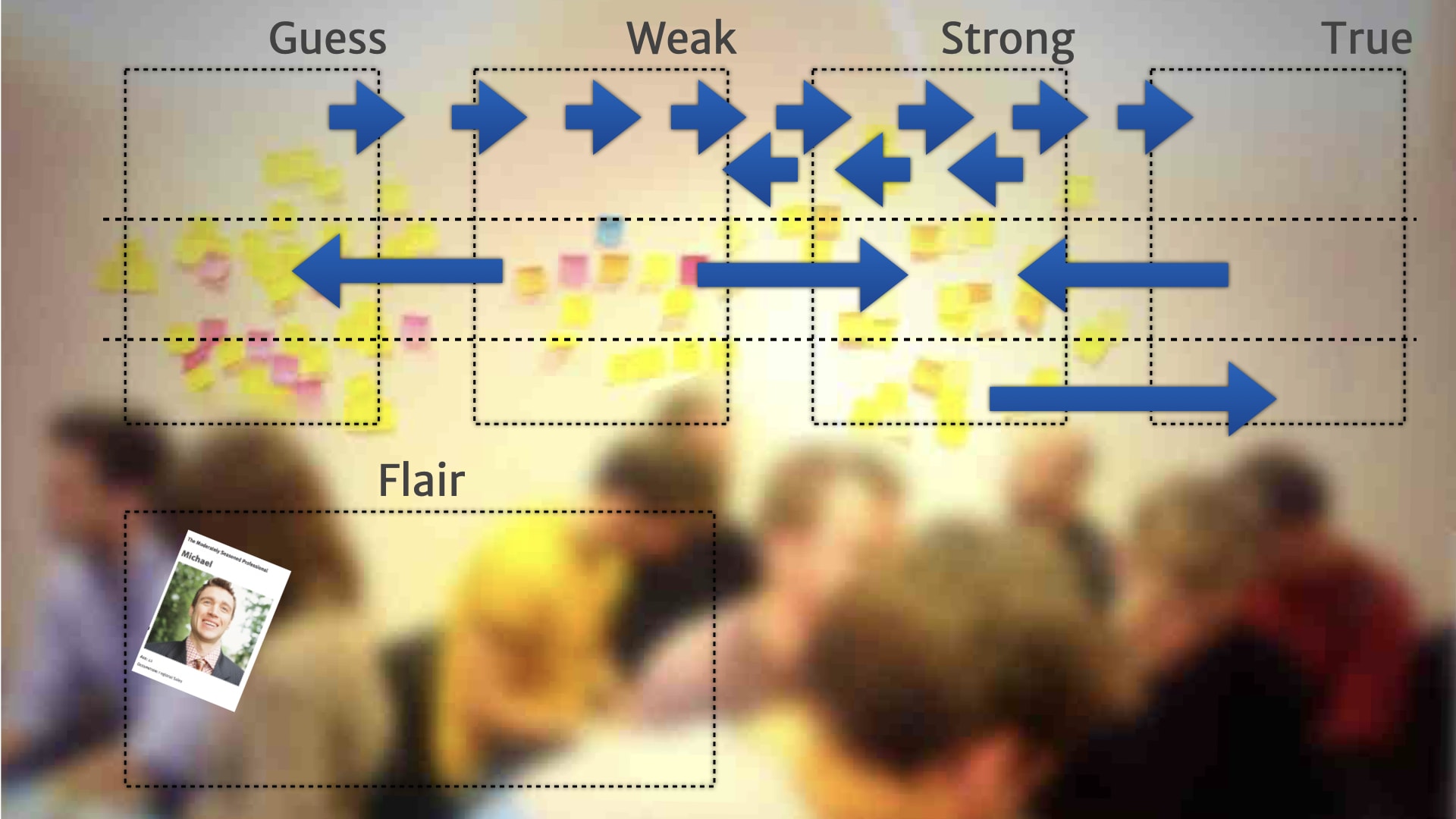
Rather than a continuum, people added a little bit of structure — and created broad categories for the research on the wall.
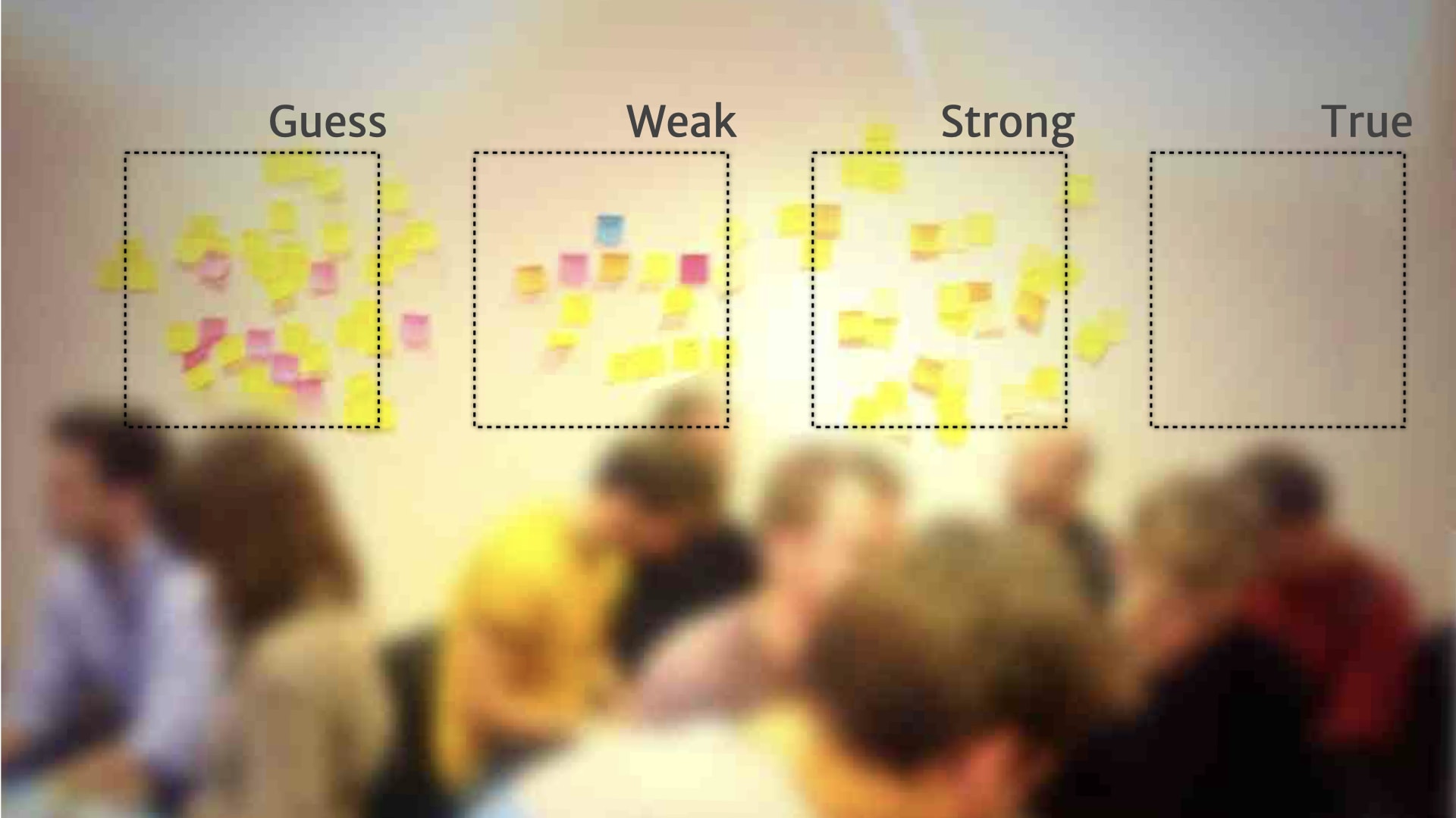
For example, "guesses" were things that they'd heard from one customer, or just something a person on the team thought might be relevant.
Once they had these broad categories, and a way of describing what belonged in them, people started formalising rules for when and how things move between the categories.
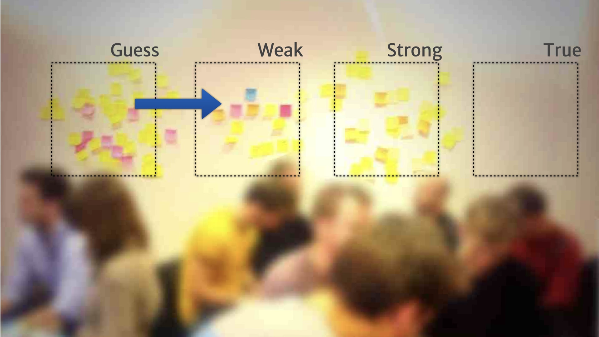
For example, a "guess" could move to the "weak" category, when we heard the problem that it talked about from five other customers.
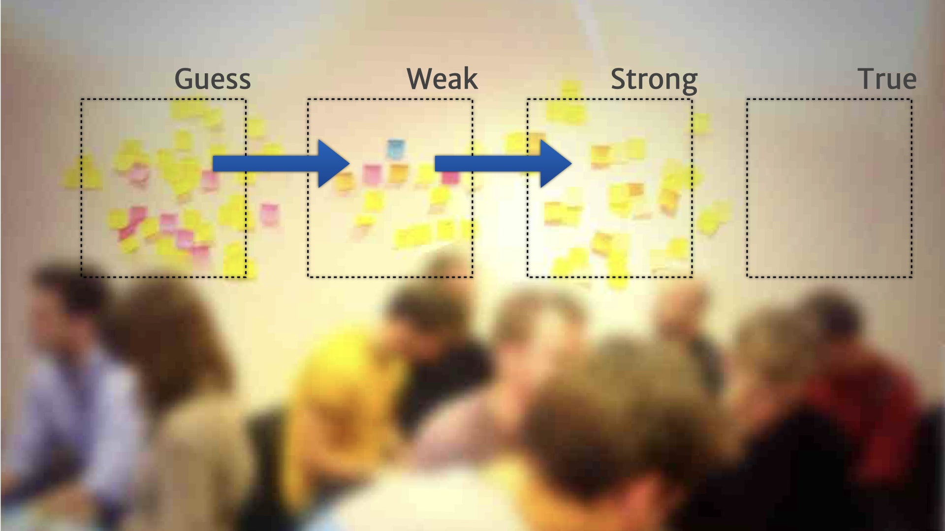
Something might move from "weak" to "strong" if we could deliver some kind of MVP experiment to validate that customer need.
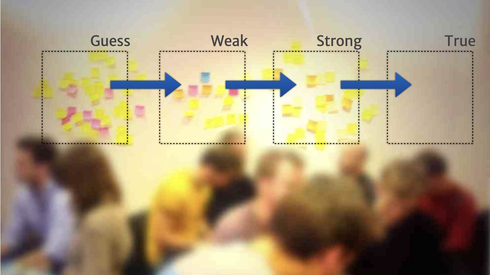
Things might move from "strong" to "true" if we shipped a feature based on that MVP; where we saw real customers use the feature to solve the problem tha research insight talked about.
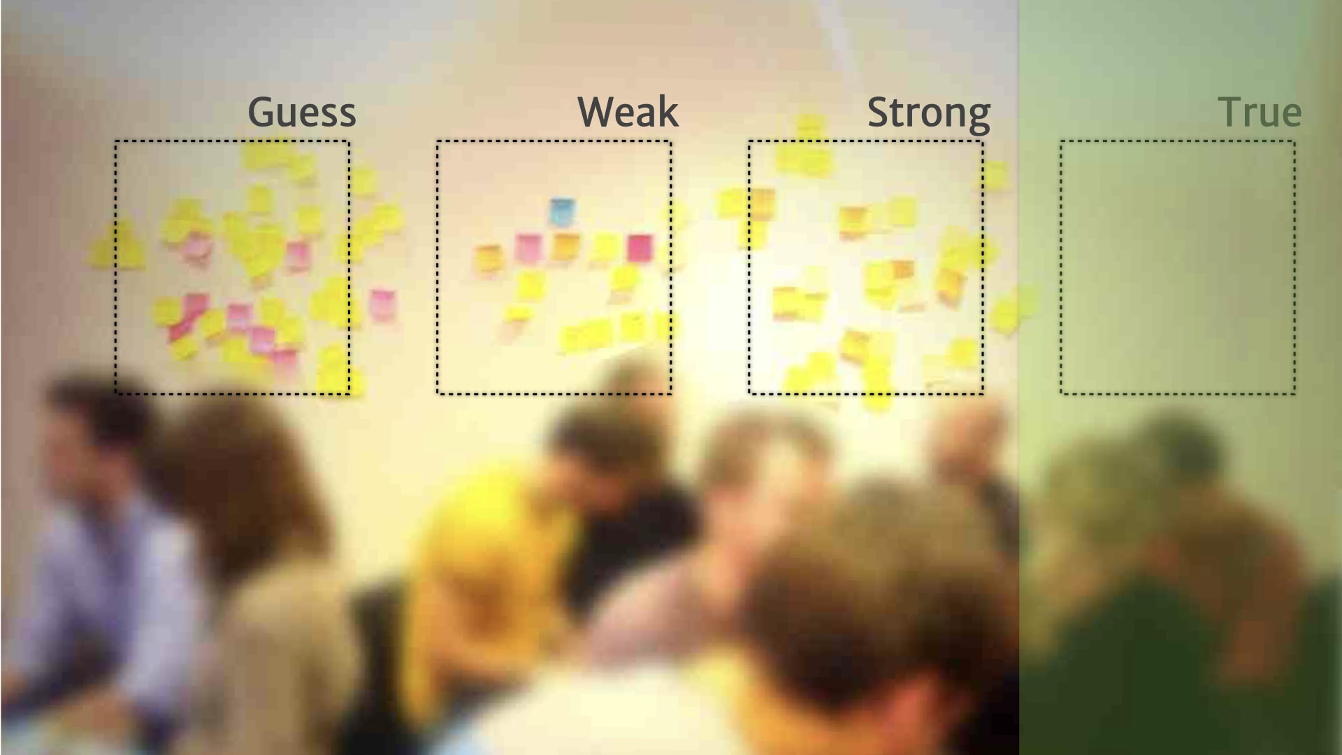
We also started seeing things move in the other direction.
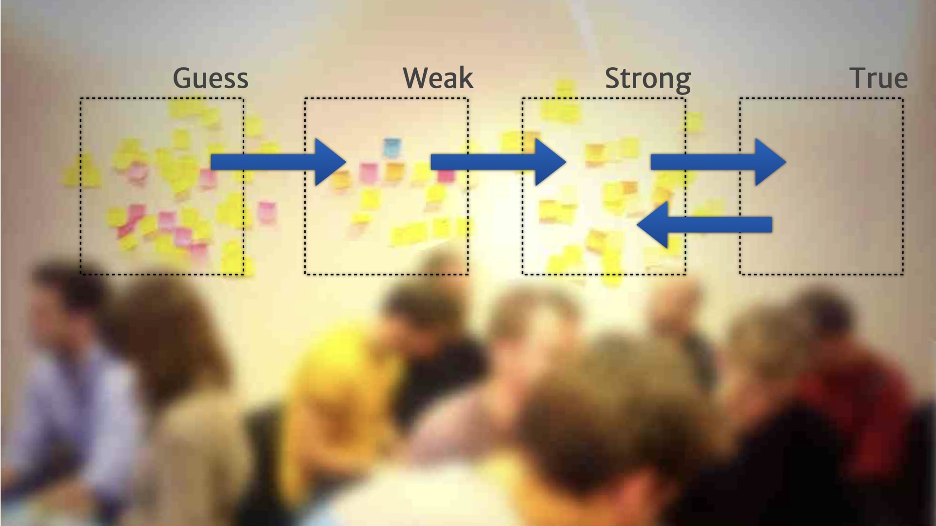
So if we shipped a feature, and nobody ended up using it, we might move that insight back a step, because there was obviously something that we misunderstood about how it actually worked.
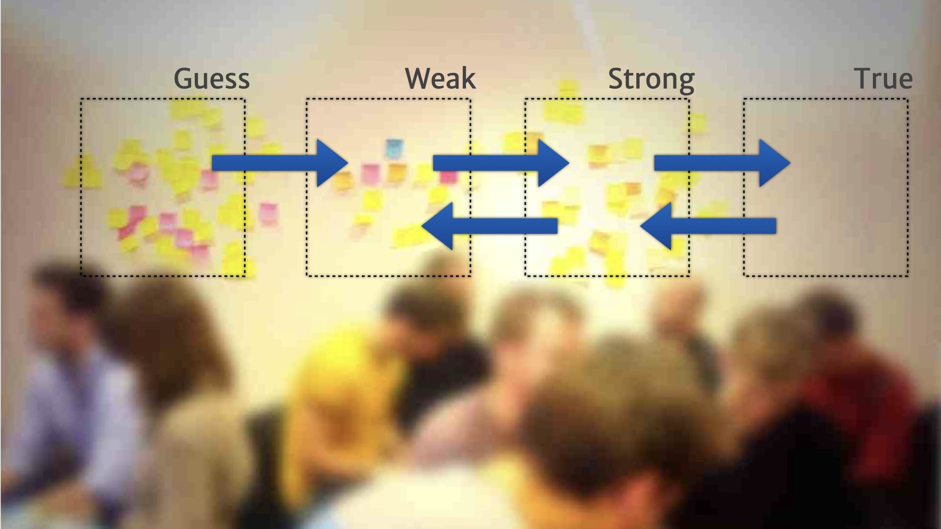
If we had a bit of evidence, but it wasn't actually used to make any product decisions over a period of time, like a month, then we might move it back a step. Because while it might be "true", it wasn't actually being used or useful for our context.
This helped people start building a playbook of activities and practices for working with the user research, and making sure it was relevant to the product work that was currently in progress. Because we have this shared resource — that product people, user research people, and developers could all come together around — we started having much more productive conversations about priorities and research versus build decisions.
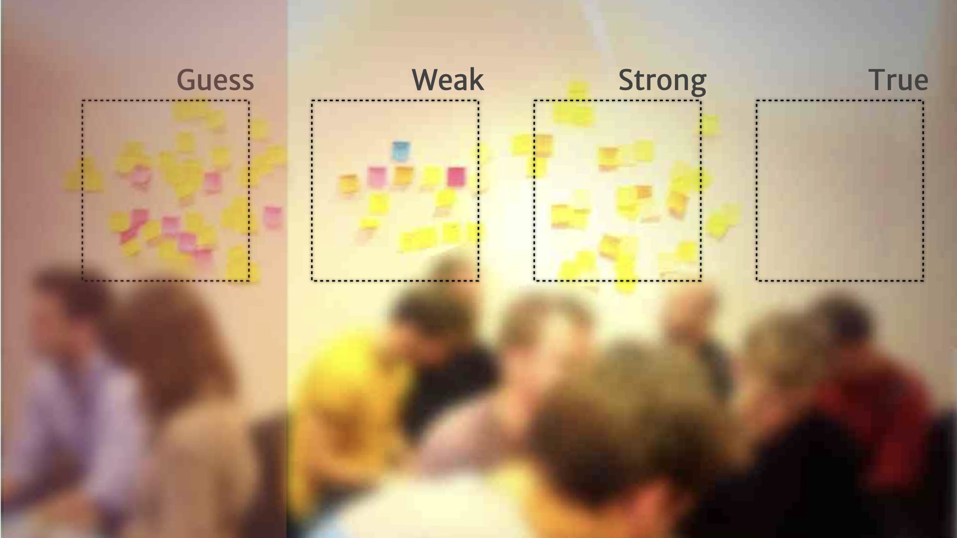
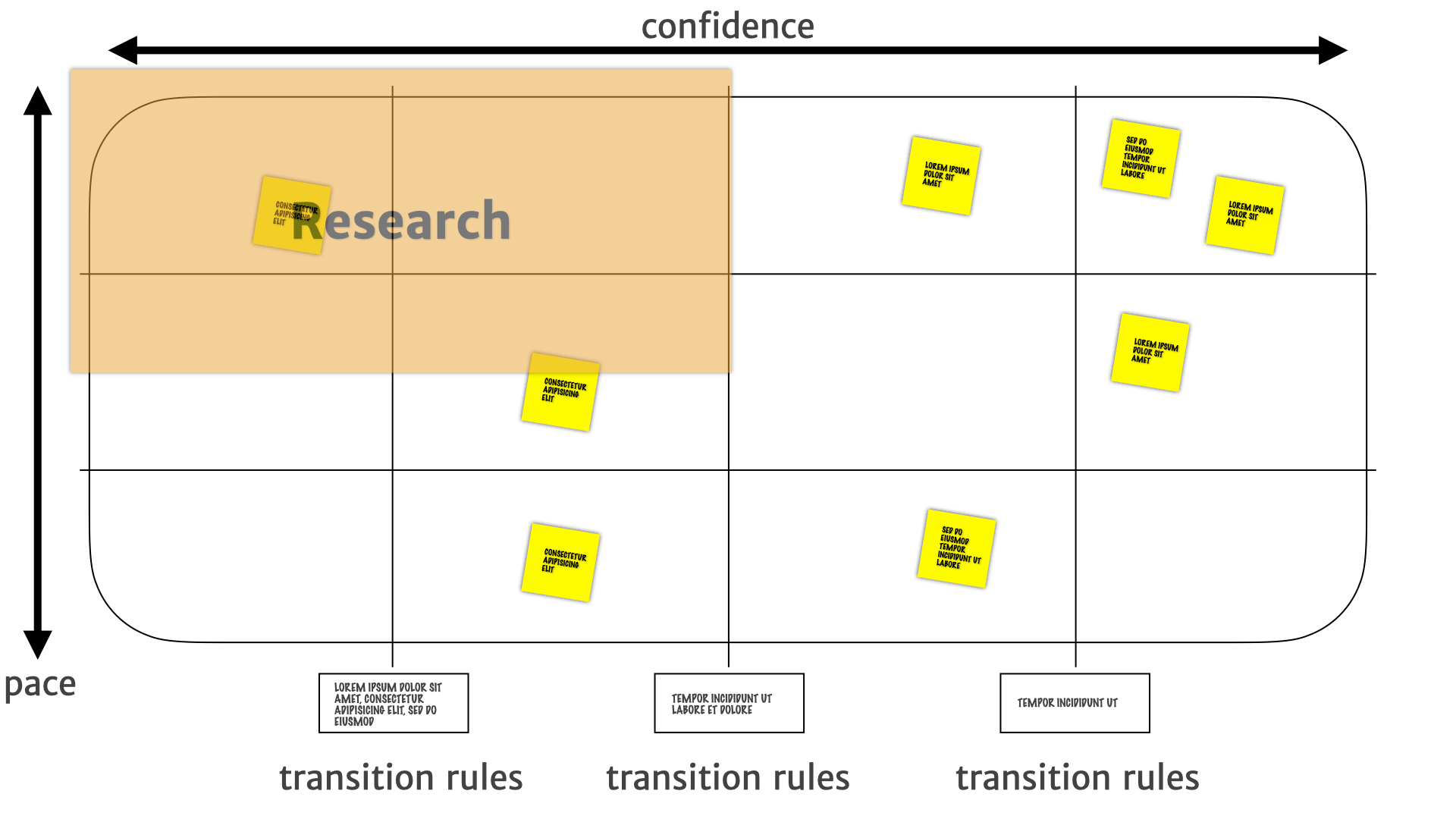
Things over on the left hand side needed more research before we could make sensible product decisions. It's probably not even worth doing a little experiment — it's definitely not worth building anything.
Things in the middle, we have some weak evidence for. Maybe it's time to do some kind of small scale cheap bets on the kind of product direction will come out of those insights — experiments and MVPs.
Once we've got stuff over to true, we have some really solid evidence that those things were used, and useful, and applied to our customers. So we could start making larger investments, bigger bets, longer term work around the things that appeared there.
This was all useful enough that we wanted to start talking about this set of practices together — and communicating it to other teams so they could get the value that this team was getting out of it.
So we packaged it all together and started talking about it with other people in the organisation. We labelled it Lean Persona.
This turned out to be a huge mistake. A really bad label.
Because when you Google Lean Persona what you see are those four-by-fours that we use in the initial exercise, and another of those four-by-fours, and another of those four-by-fours, and another of those four-by-fours and another of those four-by-fours.
It seems to have become, at some point over the last few years, the generic label for those kinds of artefact. So when people were talking about it, and they hadn't had the experience of the Scale of Truthiness, and all that work before. They had the wrong idea in their head and started doing different things.
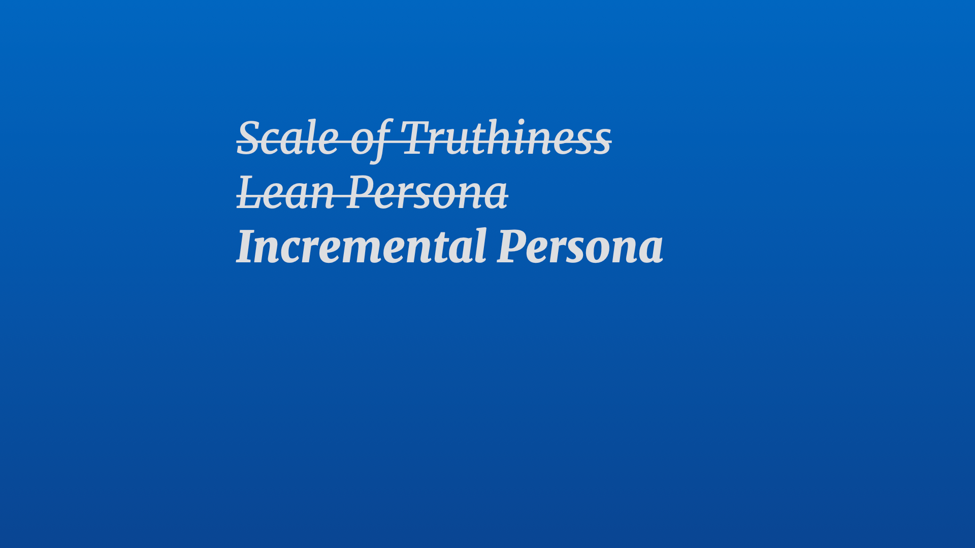
So we change the name. Since we were building up the persona over time, we thought that Incremental Persona might be a better label. Did that work better? Let's try it. Let's take that out to different teams and see what they think of it, and what they expect that practice to be.
Turned out, it was another mistake.
Because for some folk incremental persona was communicating the idea that we were delivering bits of the completed persona one after the other, rather than refining our ideas over time.
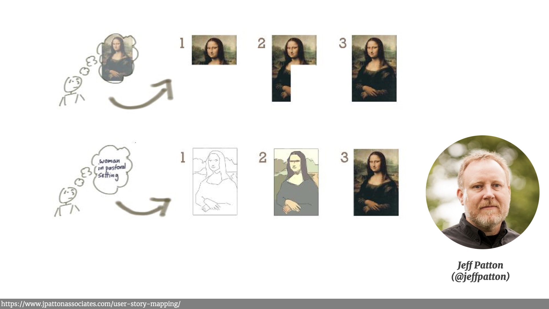
This illustration from Jeff Patton's excellent book on user story mapping makes this point really well. Incremental is delivering chunks, it has a start, and it has a finish. Calling it incremental set the wrong expectations with some of our listeners.
Iteration, on the other hand, is a process. We're refining something over time — gradually making that sketch and low fidelity insights into higher fidelity insights that we're more confident about.
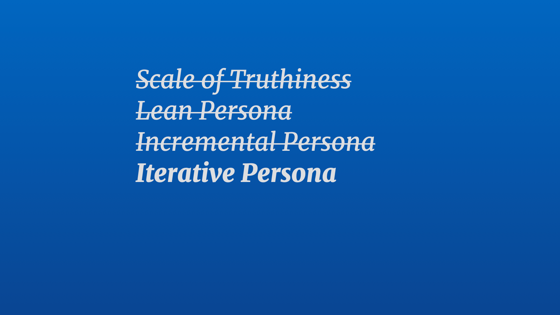
So we started calling them Iterative Persona. This one seemed to stick and be useful. And as more people use this method, we spotted some other interesting behaviours.
Remember those backward pushing rules we talked about before when insights weren't applied, and then dropped back to the less confident categories? We regularly saw some aspects of stuff that traditionally sucked for some people with persona, like gender and age, disappear off the board and move into the less relevant categories.
Which is good, because those kind of demographic things often drive bad assumptions about customers.
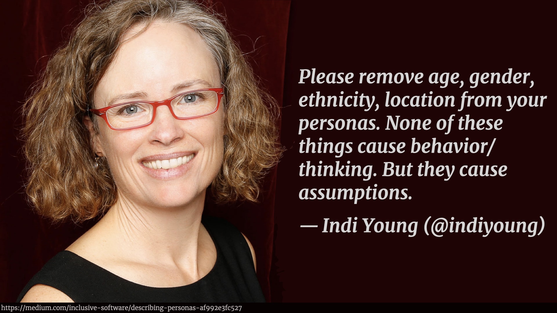
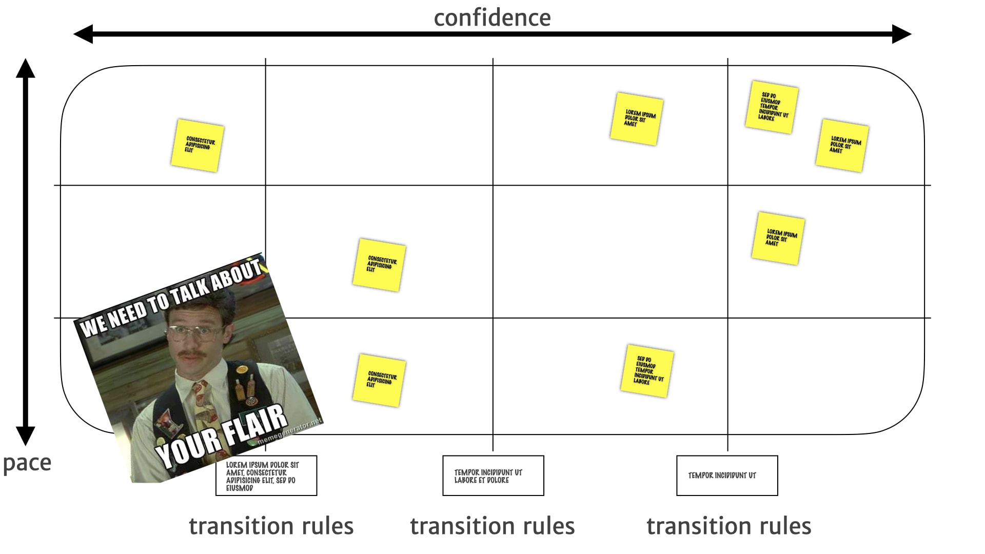
There's a great article by Indi Young on this that I recommend you read. But despite these problems, people seem really attached to those photos that we use and little bits of basic demographic information, and kept bringing them up again, if they did actually disappear off the board. Especially if they hadn't been present for the work that pushed it off the board. Even though that information didn't end up being useful for driving the product direction.
So we just put them in a corner of the board. Acknowledging that they existed — but divorced from the actual decision driving process that was happening in the main sections.
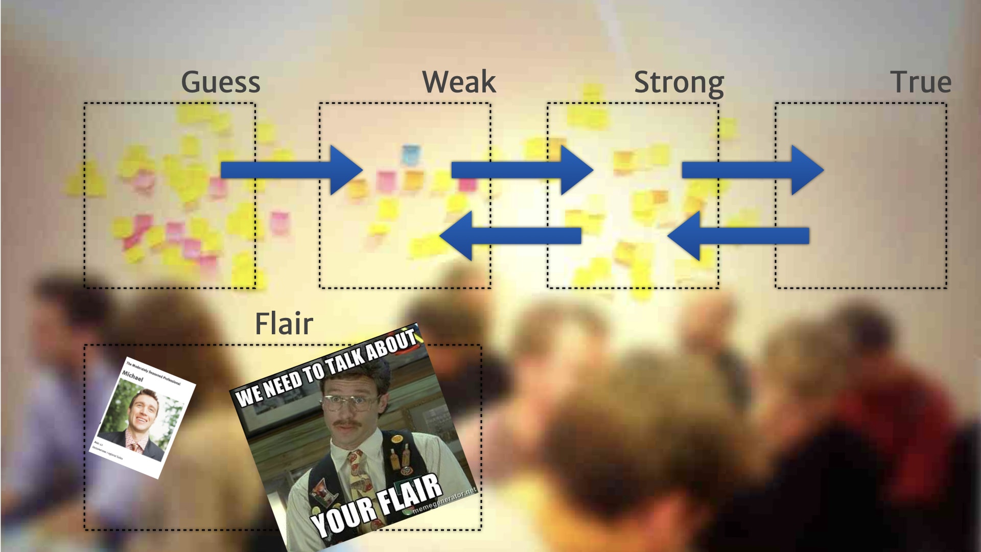
So we can point to them and talk about them, but also demonstrate the fact that while these might be "true", they weren't useful to help drive our product direction. The team started calling this "flair", which is a joke from the office space films — extraneous information that was supposed to reflect something important about a person, but actually didn't in real life.
Now we've added flair. What happened next?
After we started using this model, with a few different teams and a few different clients, we found some interesting issues around longer term stability and focus. People sometimes got distracted by the new shiny information, the new observation that just dropped onto the board — and failed to pay attention and keep an eye on the bigger problems and longer term insights.
Our initial attempt at fixing this was to do a periodic realignment exercise. We'd take a step back every few weeks or months, depending on the bit of work, and take a look at the Iterative Persona models that we'd built up.
Sometimes we ended up throwing them away, because we discovered the entire model really wasn't that relevant anymore to the work that was happening.

Sometimes we discovered that there was a new model, there was a whole chunk of research about a different kind of customer that we weren't looking at until this point. We need to kick off a whole new artefact. It didn't fit any of our existing models.
Sometimes we had two different models and we merged them together. We saw that an observation that we thought might be an important difference between two different classes of customer turned out not to be important at all. And everything could sit together in the same board.
Sometimes we did the opposite. Sometimes we split things. We had one model, and were seeing some new behaviours that were different from different groups. Having it mixed in with everything else was making those new insights hard to focus on. So we split it out into two different artefacts.
That helped, but after we started doing that, after we started doing that splitting out and merging back together, we noticed something else that was really quite interesting. We noticed that different things changed at different paces. Some stuff changed rapidly. And some stuff changed much less frequently.
For example, a new iOS release came out with new notifications and widgets. Suddenly our customers are all talking about that feature — "the app should really do that" and "why isn't it doing it?" A new thing that didn't exist a month ago that everyone's now talking about. People want to pay attention to it and do things about it right now.
Other research insights change much less often. There's an overall need for live notifications, that hangs around. But it doesn't change particularly often.
Other insights change really rarely — an underlying customer need about wanting to feel confident they're not missing important facts about the project. Those insights are well validated, solid needs, and they don't change at all, or really rarely.
These different cadences reminded me of Stuart Brand's "shearing layers" in his book about how buildings learn, which in turn was based on some of the work from a 1970s, architect called Frank Duffy who talked about "layers of longevity".
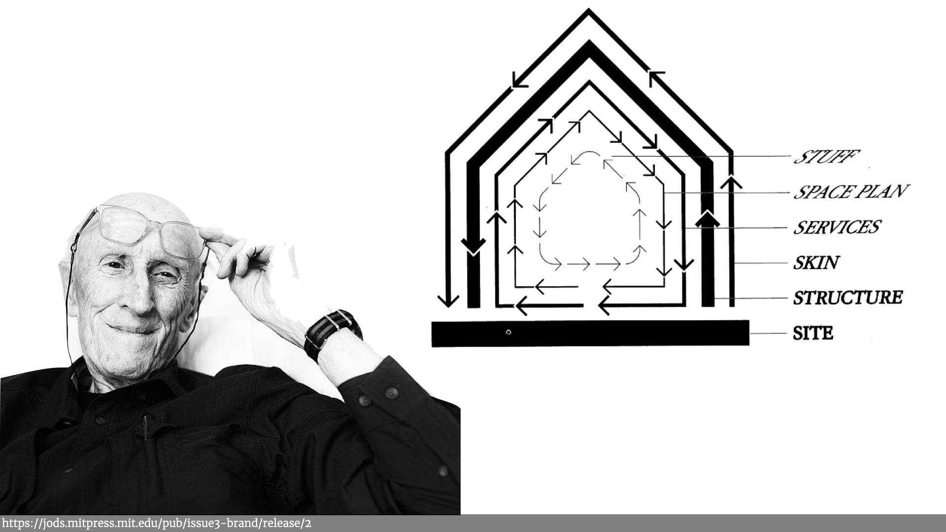
If you look at any building, an office block or a house, there's the stuff in the building, — the furniture, the decorations — and that changes a lot. People get new chairs, change colour of the walls, etc.
And then there's the physical space that the building has — the rooms — and you'll sometimes add a window or knock down a wall, especially if it's an office space with easily movable things. But that happens less often than changing the "stuff".
Then there's services like plumbing, electricity. They change less often than the space of the building. Then there's the skin of the building. Then there's the underlying structure of the building and finally there's the site the building sits on — the physical ground. All those things are all interrelated, but they change at very different paces and it reminding me of the different rates of change in the research.
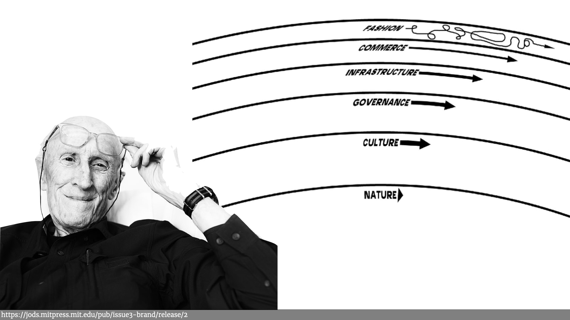
Brand later talked about Pace Layers in the context of civilizations. Fast paced "fashion", which relied on slower pace "commerce", which relied on even slow paced "infrastructure" changes — and so on until he got right down to the natural world — the ground, the earth, and trees, etc.
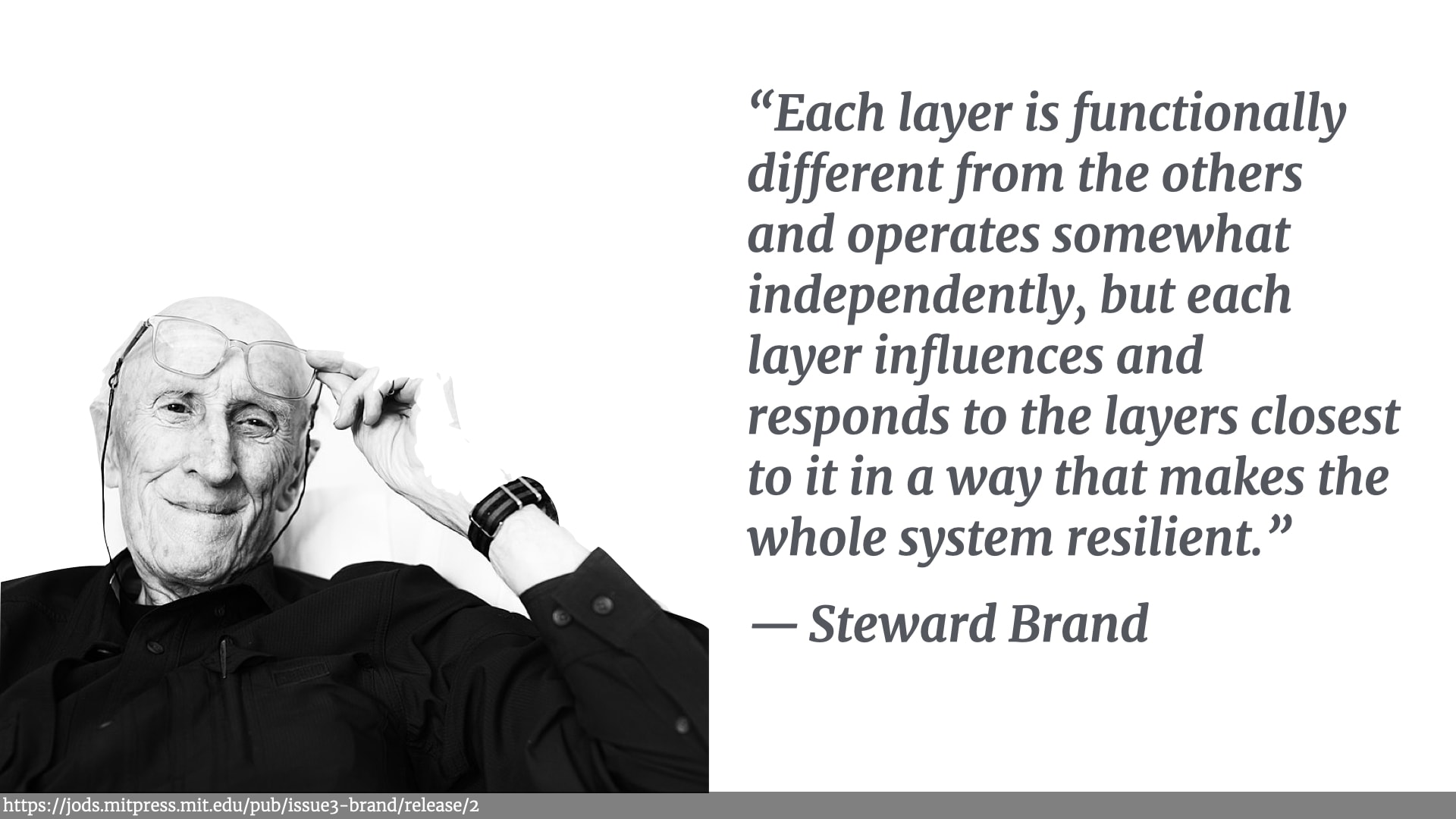
As Brand says:
“Each layer is functionally different from the others and operates somewhat independently, but each layer influences and responds to the layers closest to it in a way that makes the whole system resilient.”.
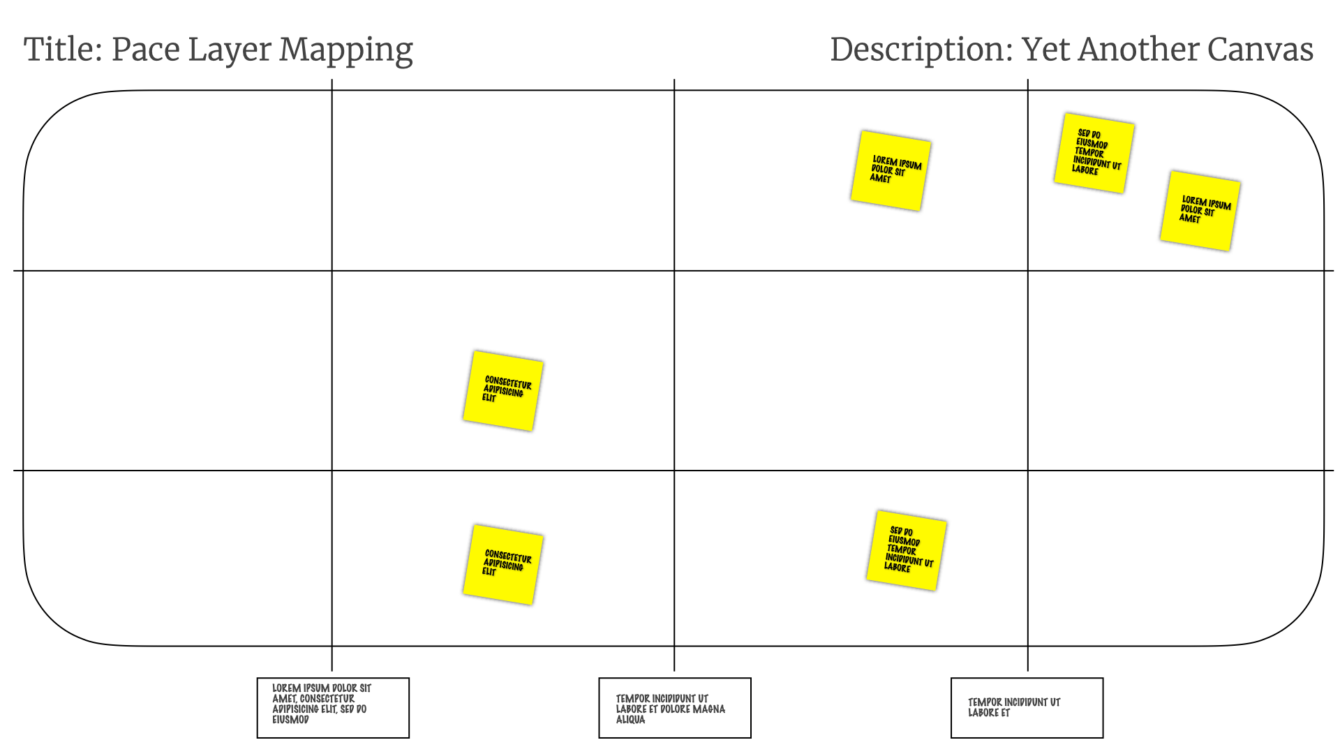
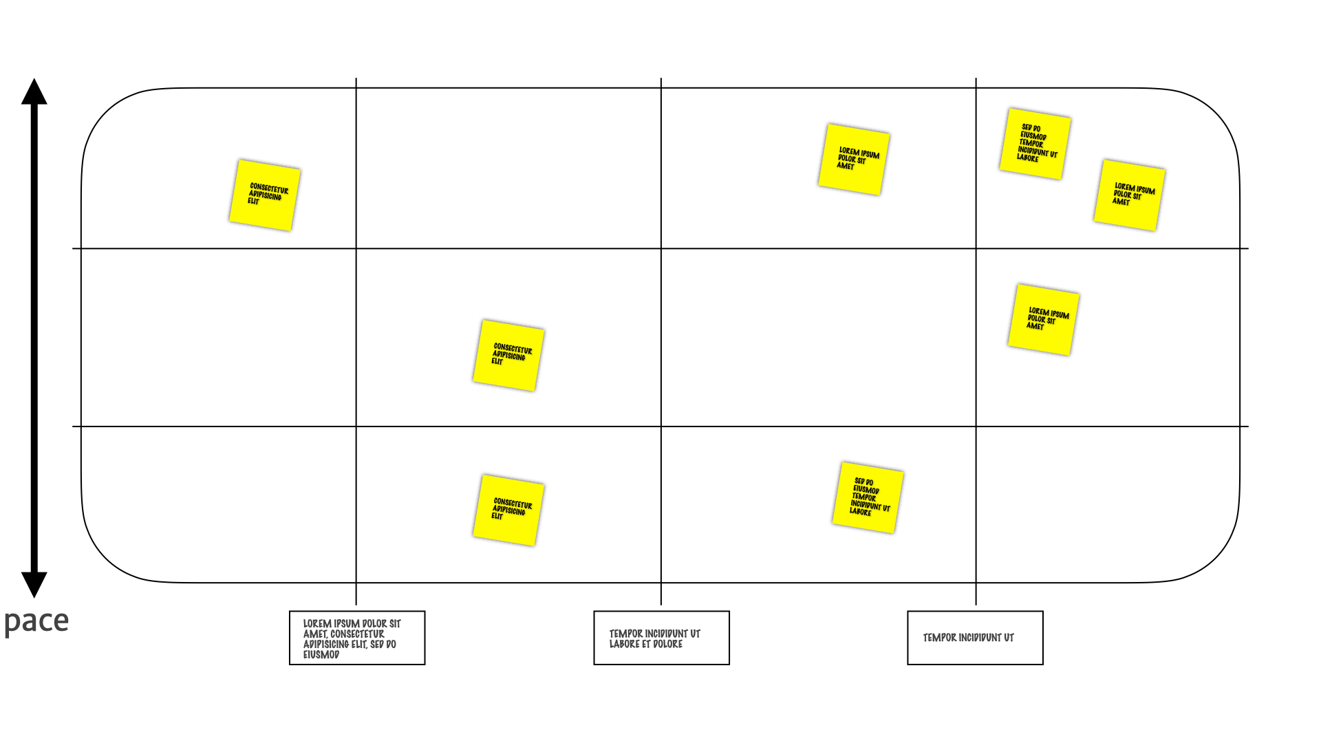
These kinds of layers of different paced work was something that we'd seen with our Incremental Persona. So we moved things around! We separated the insights that we'd seen into layers. Insights that changed a lot was pushed up the diagram, insights that change rarely were pushed down the diagram.
We started calling it Pace Layer Mapping.
We started adding things on there that weren't directly customer related. They were about product insights, or other research insights that we found out when we were doing experiments and delivering the product.
So let's review. We started off with a one-off alignment activity. Helping people get confidence in which research insights were true and which weren't. And understanding where everybody sat along those dimensions.
We started adding structure and rules to that initial one-off artefact as people started referring to it more often during product development work.
When we saw that irrelevant information was coming back, again, and again, and again — despite the fact it wasn't useful for driving the product direction — we pulled it out into a separate area.
Then when we saw that different bits of research moving at different paces, we started separating things into layers depending on how often things changed.
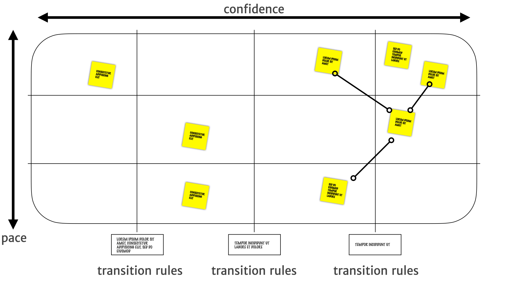
Which brings us back to that nice, neat canvas.
We have confidence in the utility of research insights mapped horizontally.
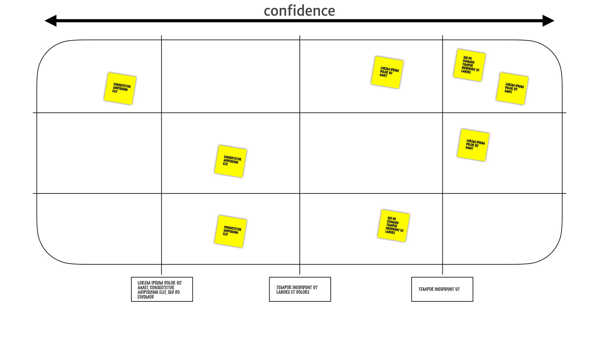
We have how often those insights change mapped vertically.
We define transition rules for how we decide to move the insights around the map.
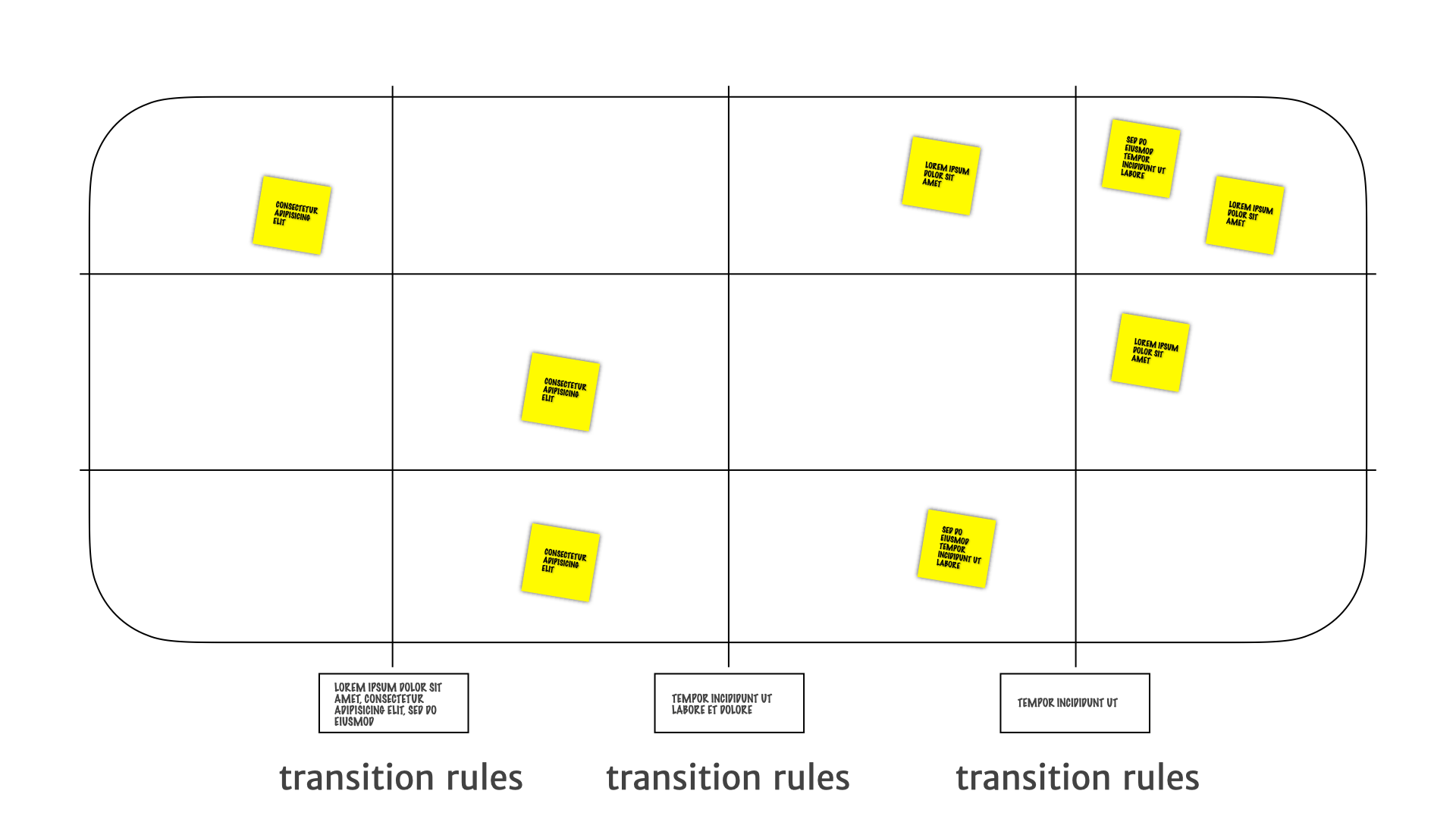
Those things all together, let us do some really interesting things with the team as a whole.
We know the stuff over on the left has weak evidence and needs more research. That means developers can ignore it. Sometimes a bunch of the product people can ignore it as well.
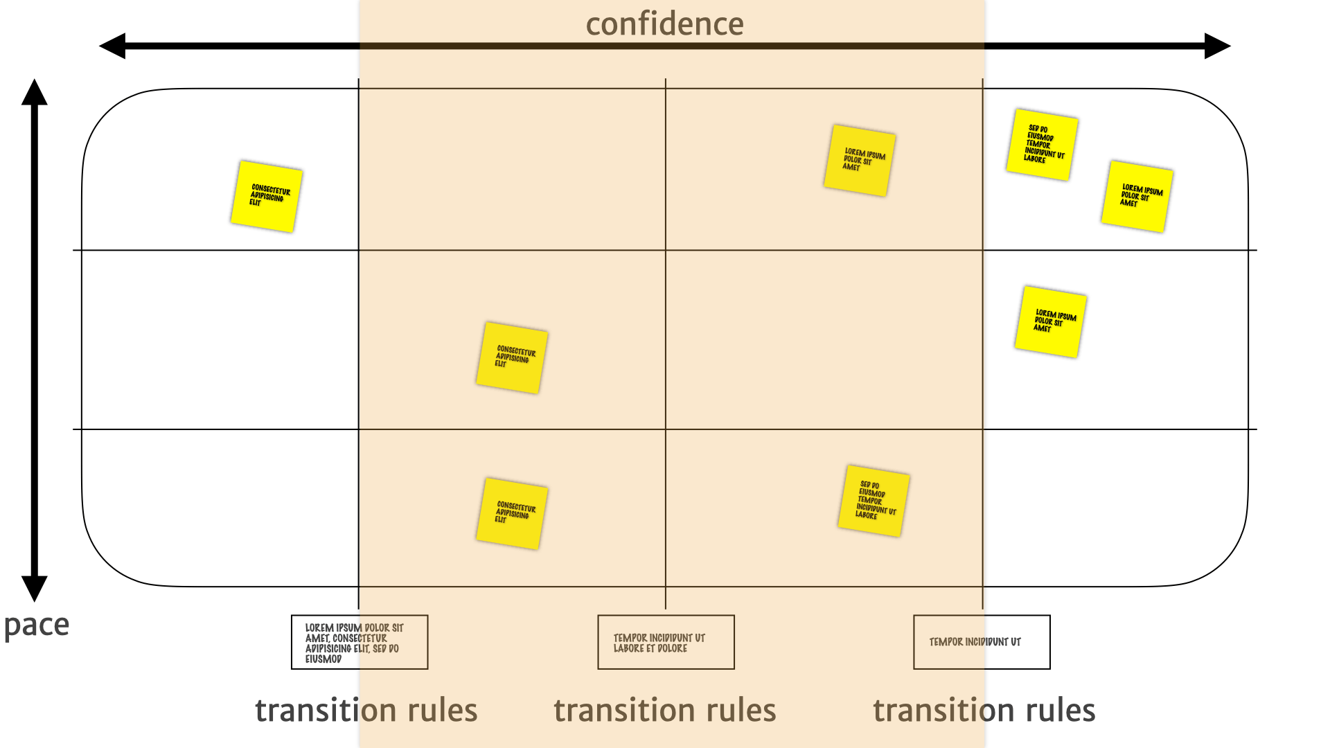
We know we have stronger evidence for insights in the middle. We have to do more experiments, or build MVPs or make small investments around the product direction and strategy.
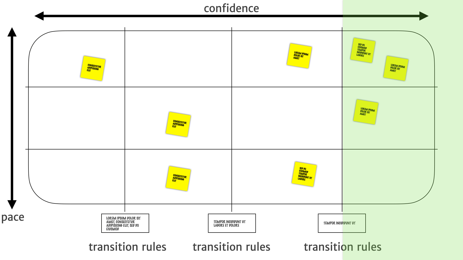
But when we shift over to the right we know we have much stronger evidence. We can use this information to drive decisions about building features that we can be fairly confident are going to fulfil a customer need. We can be fairly sure that the bets we make here are going to pay off.
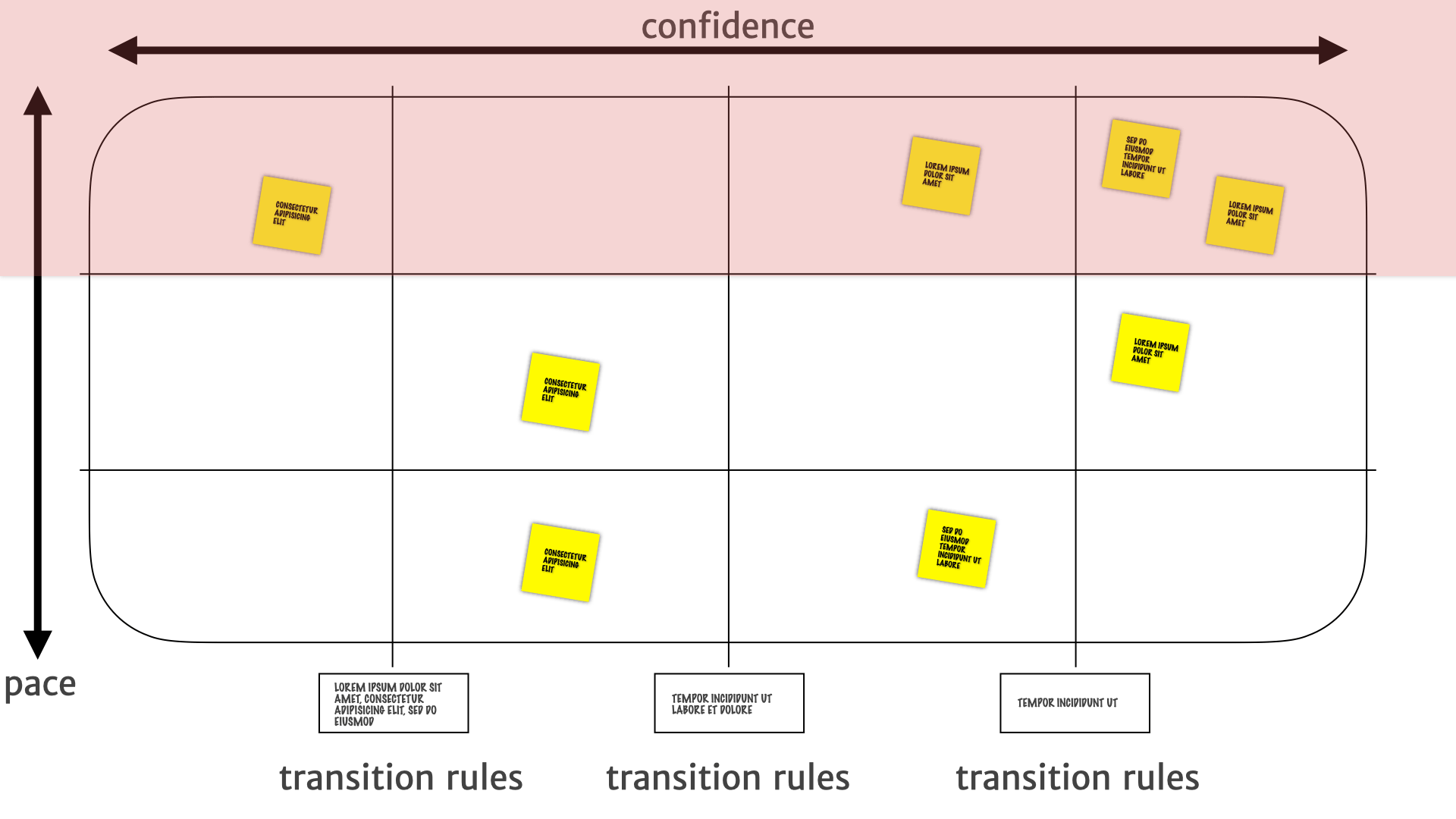
We know that the insights of the top are subject to change a lot. So if we are going to make an investment there we know that it should probably be a short term rather than a long term thing. Until we see how they play out over a longer period of time. Maybe we should just wait and not do the thing until it settles down. Those are the decisions that layer helps drive.
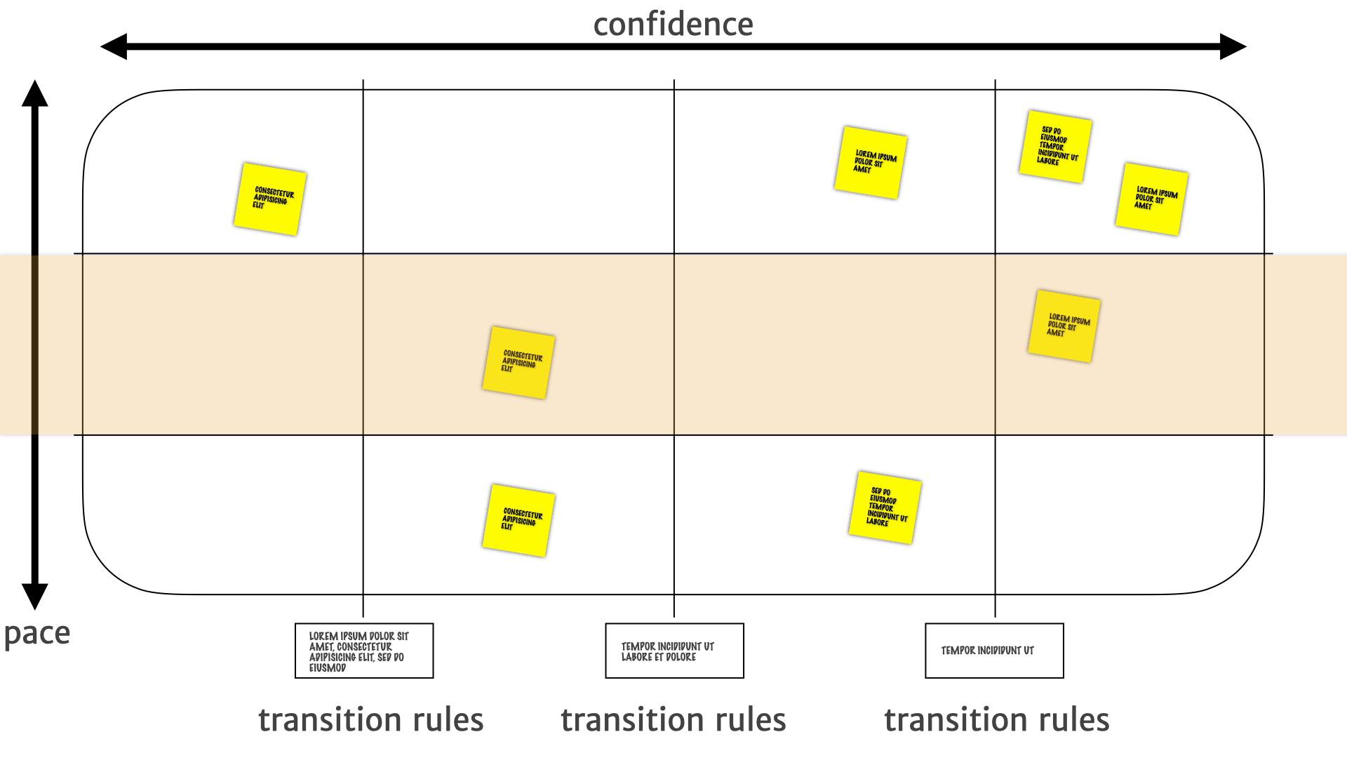
As we move down the map, we have more and more confidence that these things are less likely to change on short notice.
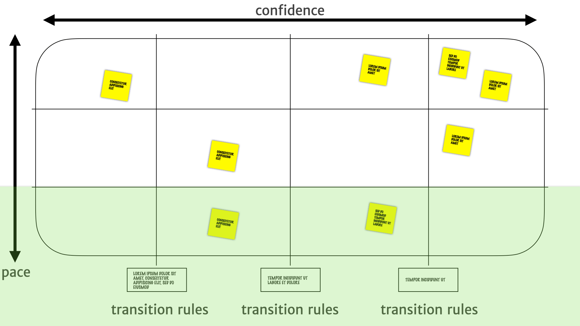
The bottom is a place where we can make larger and larger investments with more confidence. We know the bottom layer isn't going to change very often. We know the history. We know that it's not going to be something that is going to be moving around every other week or month.
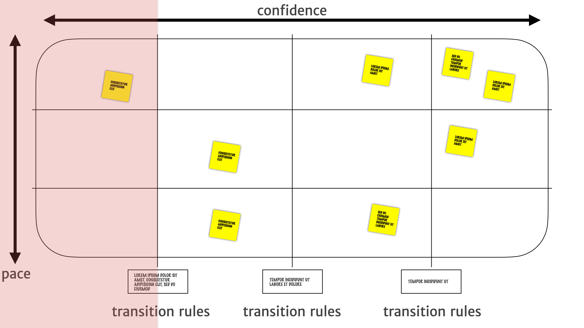
What about the "flare"? Those useless bits of information that aren't actually useful for decision making. We had that separate little category before and it's gone now. "Flare" naturally ends up in that bottom left chunk of the map. It doesn't change much and it's not useful for product decisions so it gets pushed back to the left and pushed down to the bottom.
Another way to view a Pace Layer Map is by treating it as quadrants.
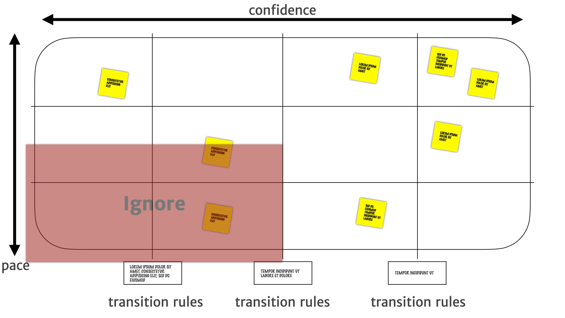
Insights that migrates to the bottom-left are things that tend not to change, are not useful, or turn out not to be true — and can generally be ignored.
Whereas things in the top-left are things that are likely to change. So probably need more research. They need a bit more attention to see what's, what's happening with those things, and whether they're going to be useful.
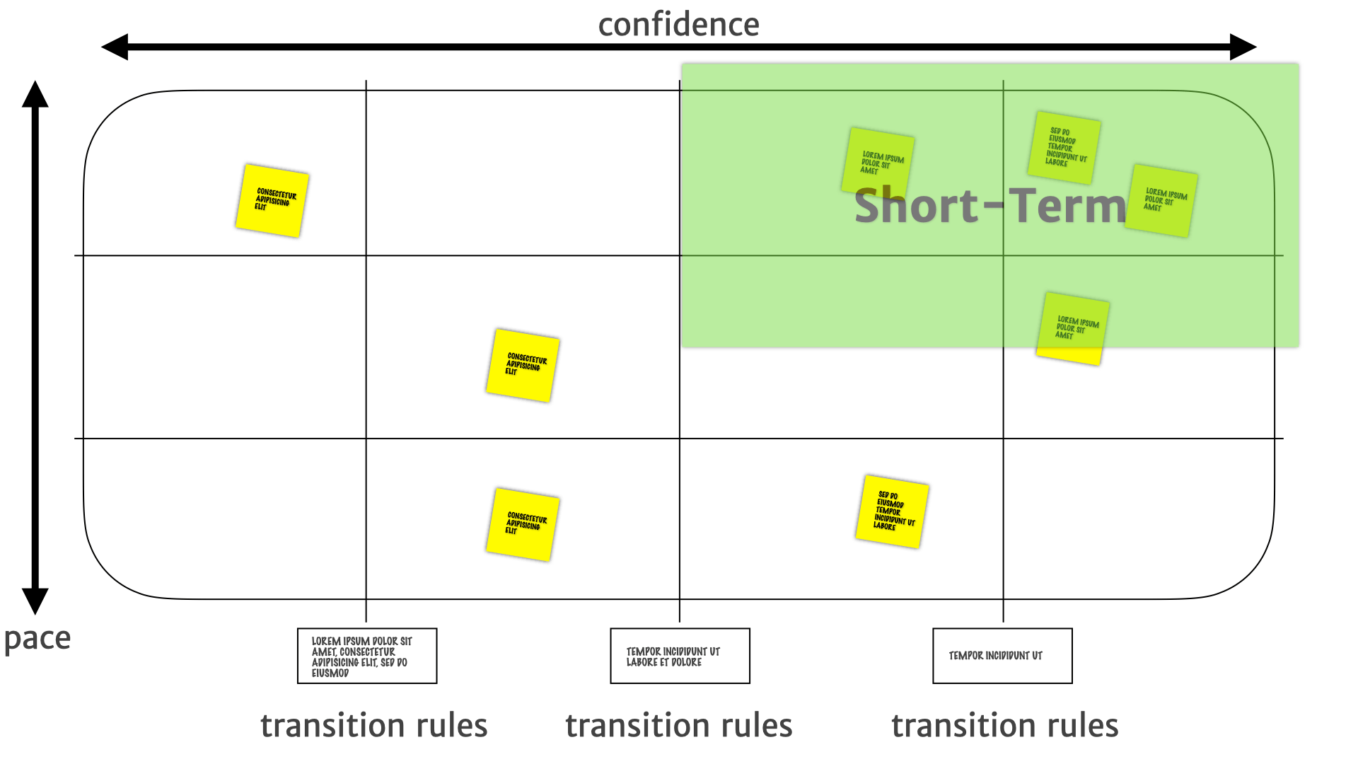
In the top-right, we have some confidence that those are actual customer problems. But things might change quickly there — they might be a transient thing. So short term investments, short term product work, smaller bets are the things that we do in that top, top-right quadrant.
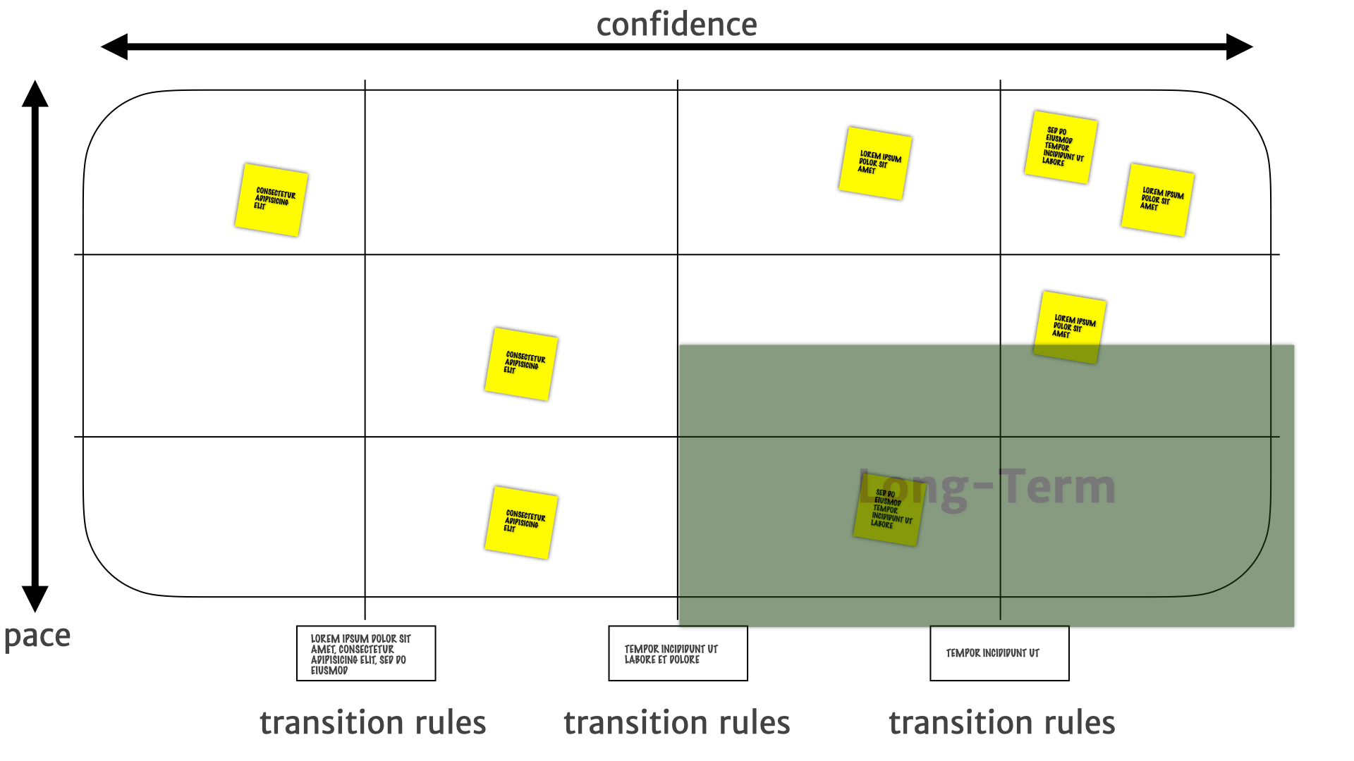
Where the insights on the bottom-right are stable. We have we have higher confidence in their long-term utility, so they're much more suitable for longer term investments — we can go build features on this right now.
Why are we saying "map" and "mapping" when we talk about using these diagrams?
Some of you might be familiar with Simon Wardley's work. He has quite a strict definition of a map. He says
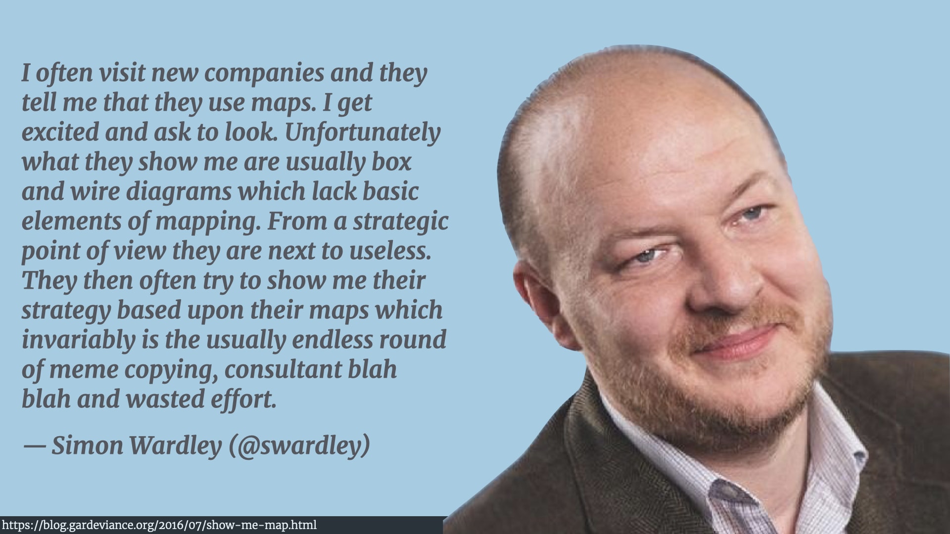
"I often visit new companies and they tell me that they use maps. I get excited and ask to look. Unfortunately what they show me are usually box and wire diagrams which lack basic elements of mapping. From a strategic point of view they are next to useless. They then often try to show me their strategy based upon their maps which invariably is the usually endless round of meme copying, consultant blah blah and wasted effort."
He doesn't like people calling things maps that aren't maps!
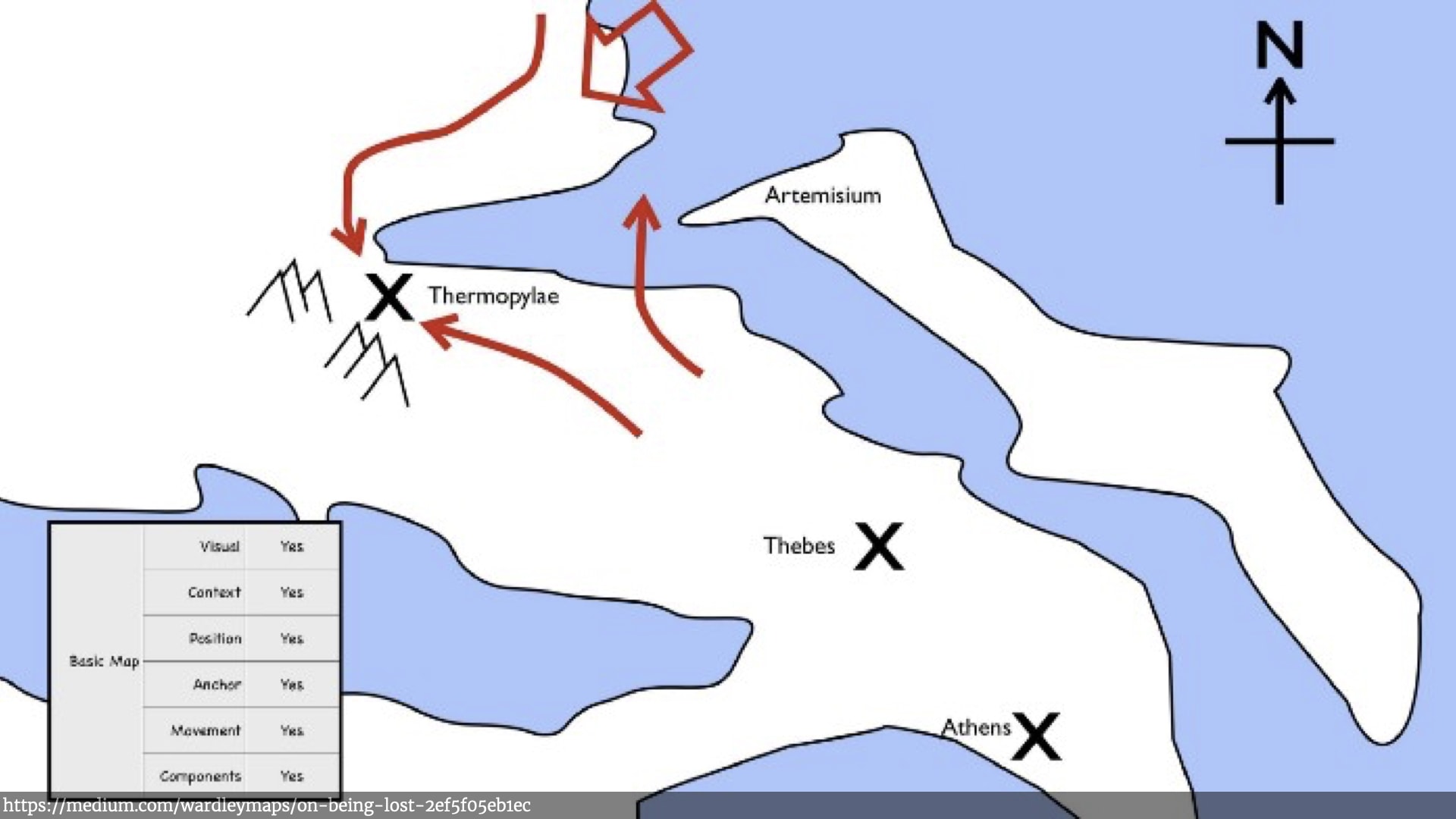
This is Simon's definition of map (this is a picture from from one of his posts). The key elements for Simon are that it's:
- Visual.
- It's context specific, it's about a particular situation or environment.
- There are separate movable components on the map. So in a military map, there are armies.
- Those components have position relative to other things on the map — there's some kind of anchor. A North Star, a compass, a grid, etc.
- The components move around. So you can shift things and see how things move as that context changes.
Pace Layer Maps have all of those properties.
They're visual. They're about a particular context — a particular bit of research, a particular product context. The components, insights, and other things on the map have positions relative to an anchor around confidence and pace — there is a architecture to it. The components move around and we have rules for how those components move around.
Once we have this mapping, we can start seeing the connections between things more easily.
For example, a long term established need to stay current. In that bottom-right quadrant might drive a more medium term insight around staying up-to-date, which might in turn drive, short term new customer needs about building a new notification widget for a new operating system, or having new push notifications in the web app, or Alexa notifications, or whatever.
So people can start seeing the connections between different aspects of research and product work all in one place, which is just super useful.
That's where Pace Layer Mapping is now — but as I said at the start, if you're going to take one thing away or take away this…
Remember the messy journey we took from that initial one-off alignment activity, through renaming, adding new structure, adding rules, adding flair, discovering the new structure around different pace layers, and how to interpret that map once we had drawn it. That was that was a long, messy journey, with lots of different clients, over a period of years.
And that's the lesson I want you to take away: The artefacts and practices that you use should be useful! When they're not, please change them until they are.
Further Reading
- The example 4x4 Persona sheets used in the Scale of Truthiness exercise were from Janice Fraser's workshop deck.
- An introduction to Dave Gray's Empathy Map canvas
- Cindy Alverez's “Lean Customer Development” book
- Todd Zaki Warfel's talk on Data Driven Persona
- Jared Spool's article Personas are NOT a Document
- Jeff Patton's work on User Story Mapping
- Indy Young's article Describing Personas
- Stuart Brand's article Pace Layering: How Complex Systems Learn and Keep Learning
- Simon Wardley articles on Show me a map! and On being lost
Keep in touch
If you liked this you'll probably like our newsletter (No fluff — just useful, applicable information delivered to your inbox every other week. Check out the archive if you don't believe us.)